Reflection: Early experiments about visualisation
In this stage, I’ve done a prototype of visualisation application, it available user to support dynamic data and translate to geometric shape. I used JavaScript to build the application as well as NodeBox and illustrator. Then I will review the process of work.
Source of idea
At first, we visited the V&A museum, there are series of digital arts exhibited. I observed the layout and variant of graphic, but was confused by the irregular shape. I tired to find the reason and the meaning of artists want to convey. I failed.
这些数字渲染的作品充满了不确定性和随机性,但是不变的是他们的排列方式。艺术家用特殊的算法计算了图形的位置,并通过控制变量的方法让图形拥有不同的形状或者结构。
In M.Mohr’s work, I saw his algorithm generate shape as random symbol, they are ordered in grid system with a tiny translation of position. So I want to collect information and data as variable to generate more specific shape. I chose Chinese letter as the source of information, because Chinese letter can be separated to be different parts which have individual meanings.
Work process
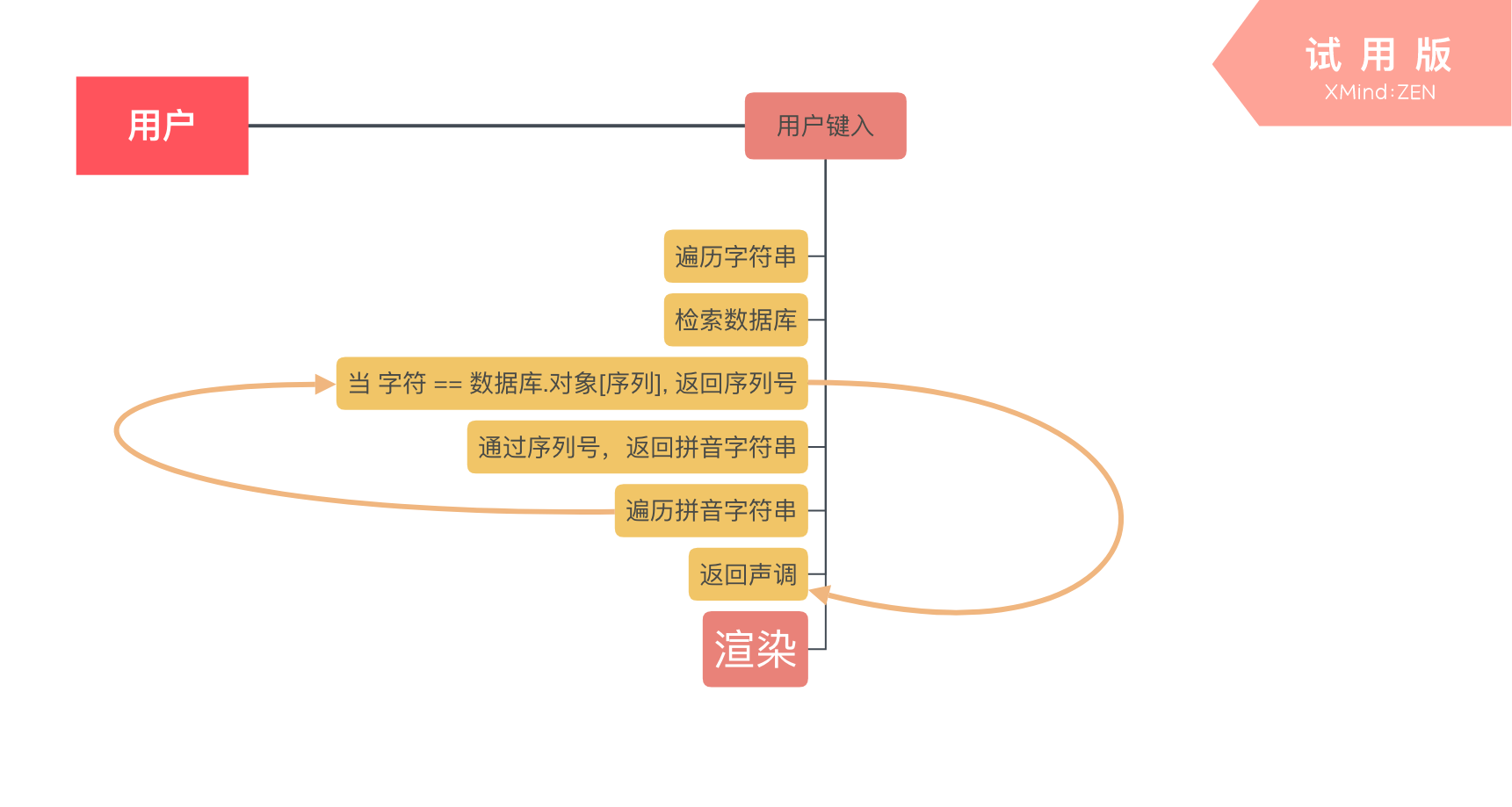
To complete my idea, it is important to distinguish the letter. I set a database, it will return the value of phonogram, stroke count, radical of letter whatever user type are( except special/strange word or symbol ).
After return of data, I used JS to analyse that and change the image which show on Web.
通过的采集的数据的分析,再遍历数据库,当有匹配对象的时候,返回它的详细信息,例如拼音,笔画和部首。 通过拆分返回的拼音字符串,再遍历每个字符串,与音调的数据库匹配,返回后即可以得到那个有音调的拼音所属于的音调。

Base on the tone of letters, specific shape will be set on Web. The method of render image is add and append tag in DOM as
<embed src=Dynamic link>svg img</embed>
Goodthing
To see a draft effect, I chose tone as variable to make graphic. I successful complete the logical stage (逻辑层面). Though it just show tone as characteristic of a word, it is easily to add more effect on shape. It clearly shows the differences of Chinese character which same as my first expectation
Something need to develop
More illustrative
I used shape of symbol to show the tone of word, which is same as we daily use. But the final outcome should not be the showing of symbol. The expression of tone might be a method/ structure when rendering shape. So, they the variable from tones should have the ability that show the change of tone/ level. Curve might be a good choice.
In future work, there will more information be add in graphic, but how should I keep a balance? What’s the composition of individual graphic?