~ 2019-10-21 >>
Recent Posts
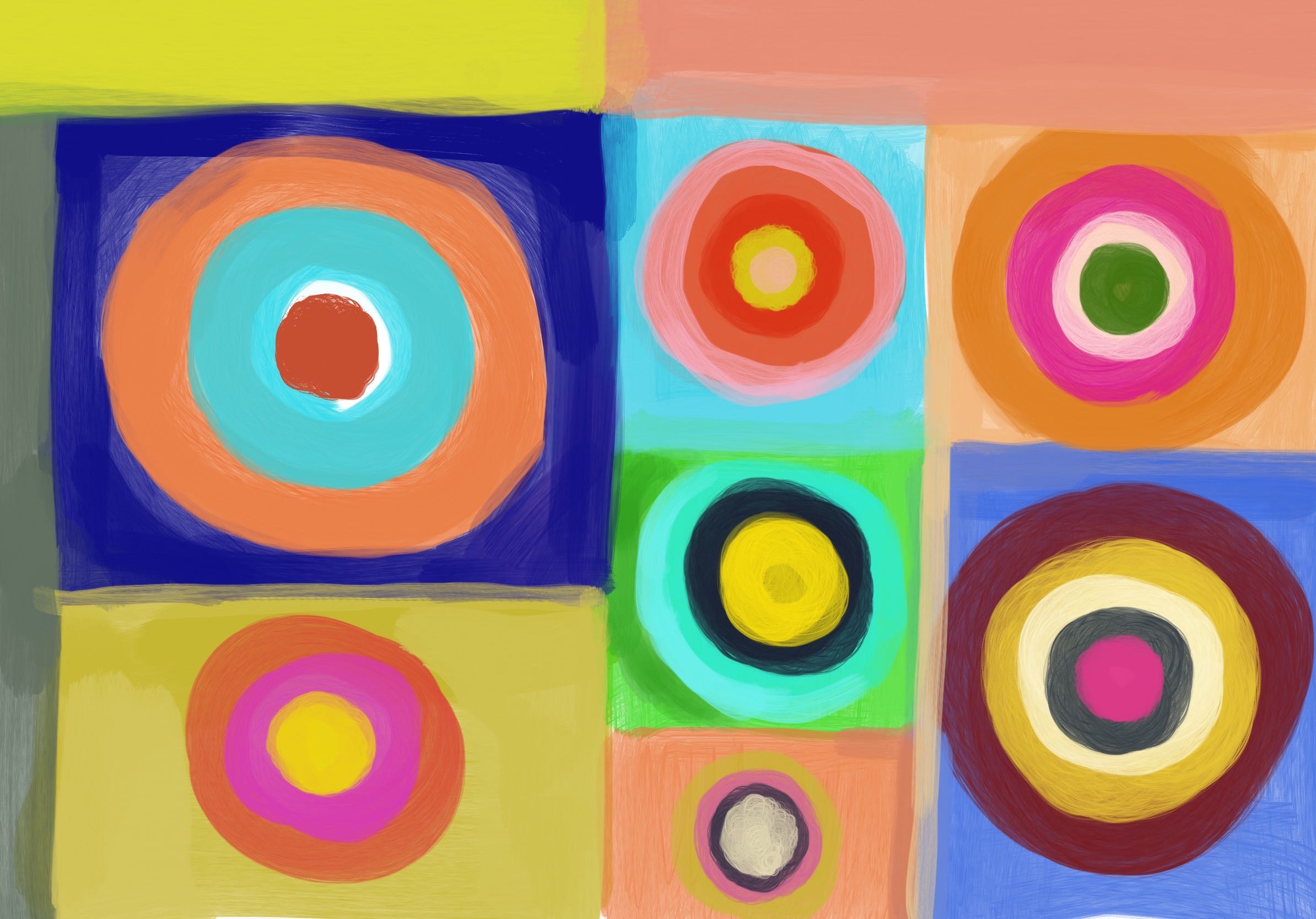
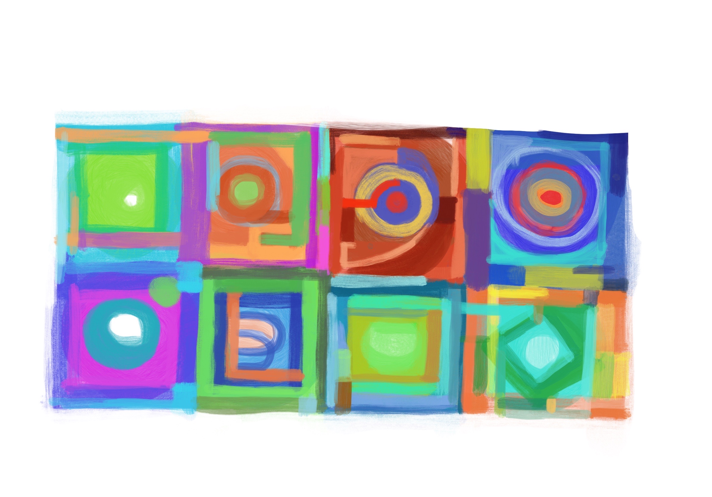
设计的尽头
嗨呀,我终于毕业了,此处需要🎉。那么,我可以使用中文,来书写博客了。那么,为什么之前就不呢?我也不知道。不管怎样,使用母语来写作总归是更流畅通顺的,至少自己读起来是这样,呵呵。
好的,那么来说说 设计的尽头 吧。其实,critical的说,设计亦或是别的,都是没有尽头的,毕竟物质是运动的。一个静止的物体,在被观测后,它便改变了或是影响激发了观测者的意识。此处要说的尽头,只能是一个非常狭隘的定义,即,可用性与实用性的最终平衡。
抽象的东西是很难 measure 的, (?我为什么要穿插英文,只是想复习一下关键词而已)。好比玫瑰香与桂花香,你能分别浮现出它们的印象,但确无法比较出它们的高下。但是,设计允许我们设置一个明确的对象,即,喜好,对错,是一定程度上可定义的。所以,在平衡可用性和实用价值的时候,必定要以 有明确目标 为前提。
可用性
什么是可用性,在我看来,越简单的东西可用性越高。更具体的说,一眼就知道使用方法的东西,可用性最高。反之,容易出错,产生歧义的东西,可用性低。体现在视觉表达的话,一张海报,传递的意思越明确,可用性越高。其中还包括,视觉上的可视性和潜在含义的可读性。
以上的说话,很容易想人联想到白纸。白纸上空无一物,但它确并没有可用性。因为它在单独环境中,是一种 无表达,即无论多少眼也不知道使用方法或表现的含义。但是,即便白纸上只是出现了一个标符,那它的可用性即非常之高。视觉上,它有完美的可视性,读者完全不会注意到多余的元素。但是,在含义上,它确有多种的可能性,取决于读者的文化环境或思想状态。但是这样的可读性并不是准确的。在以 有明确目标 的设计中,我们需要把传达的信息适当缩小来达到准确传达的目的。
可用性很容易理解,但是它太简单了,没有实用性,或者说功能性。一个符号,一句话,它可以表现得很准确,但是传递的信息还是少,和图像相比,它更难引发多余的思想。虽然极简的信息,它有被各种想法解读的可能,但是因为不足的限制,无法传递准确的信息。所以我们要必定要考虑实用性。
实用性
设计的实用性是什么,它要能满足用户的需求。用户的需求可能是有多种的,理论上来说不存在绝对满足的需求,或者说,一个设计不会满足用户的所有需求。比如说,一个门把手,功能极为简单,开门。但是,有一种完美的门把手吗?完全满足我的所有需求?
- 不膈手
- 能看得
这就是门把手的所有需求了吗?可能不是,毕竟我们早已经习惯了妥协。妥协,以至于遗忘了目前门把手的缺点。
- 我双手拿了东西,只能用胳膊肘开门
- 我为什么要开门,它不能自己开?
- 我为什么要锁门,它不能自己锁?
电动门?那我为什么需要门把手?排除生产力和经济因素,没有一个产品是完美的,当它达到完美的时候,它可能会消失。(此说法有待证明)所以,设计要尽可能的满足需求,但不必追求完美。同时,还要保证可用性。因此,在设计中,专业的设计师往往是使用减法,把产品的多余之处逐渐删去,以增加可用性。
一个拥有很多功能的工具,或者很多元素的画作,它往往是复杂的,不易快速的明白使用方法或着意会表达的含义,所以复杂的东西,也未必是实用的。实用性和信息量的比例不是简单的等比例,它必须要有明确的 需求和 用户背景 才能定义出来。
审美,是实用性的一部分。作为产品的属性,审美不应该被单独出来。如果说艺术创作失去了审美便失去了灵魂,设计失去了审美还有它的基础功能。一个丑陋至极的海报,当你能把它解读成 海报的时候,它便已经发挥了它的功能:你被它所吸引(即使并不想看),你看到了,接收了它信息,即使你觉得无意义。即便它是丑陋的,但它不是无价值的。一个丑陋至极的画作,当你把一幅画作定义为丑陋至极,你绝大可能拒绝接受它的表达,它的含义,(除非作者就是想表达丑恶)那么,画作便失去了意义。因此,在我的观念里,设计的审美需求不是 必须,它甚至可有可无。(极端地说)。为什么?设计和艺术区别到底在哪?这是个比较复杂的问题,但是通常可以解读成:
- 设计:我想让你 明白。
- 艺术:我想让你 去明白。
艺术作为一种自我表达,它有时不强求读者的绝对理解,绝对同意。但是艺术家渴望自己的作品被思考,被反馈。所谓反馈不一定是物理的,而是精神上的交流,某种过程。即使可能感受不到确切的信息,但是得到反馈是艺术作品的最终目的(自我反馈也是一种反馈)。通俗地说,没有人想自言自语,除非他是疯子。
大部分时刻艺术设计两者是不会分开的,所有人都渴望被理解。但是设计的商业模式注定要求设计师必须确定目标客户,即部分人。而且设计的最终目的是 明白,知道。所以,即使不被接受不被反馈,它也能把信息传给用户,从而实现价值。我的意思绝对不是审美需求在设计中不重要,我的意思是,审美只是实用性的一部分。
审美是什么
视觉上,审美需求意味着用户希望看到 好看的东西,所谓好看,即符合其文化背景,意识形态,精神状态的需求和认同。举🌰,红色在亚洲文化是被认作喜庆的颜色,在西方文化则更代表激进,暴力等强烈的表达;而审美在意识形态上的差异则更好理解,人各有所好;精神状态也会改变人的审美需求。假使,人需要自我满足,自我修复,当人处于情绪低落的状态时,他潜意识的渴望见到积极乐观的东西,或者他会用相符的审美方式来表现自己以获得理解。
审美不只是美,审美不完全代表美。审美是个人或者某特定群体的喜好,根据多方面因素的影响而改变。所以在设计中,设计师所满足的审美需求,是指特定群体的审美,简单说,用户乐于看到的。
平面设计的需求
作为平面设计,它只负责视觉上的信息传达,因此,设计中实用性的要求会相对较低,比较适合展开讨论(我也不懂工业设计啊呵呵)。海报的🌰不想再提了,来说说字体的设计吧。字体在平面设计中有几种主要的应用:
- 作为LOGO
- 作为装饰
- 作为标准字
用作的LOGO的字体直接代表了某种品牌的精神或主题,有通过艺术变形来体现形象或产品的;有通过形式颜色来表现企业精神的;作为装饰的字体,它的外形往往最为重要,主要的目的是平衡画面中的形式感,或者吸引注意力,风格化;而标准字则是在提供明确的信息的前提下能表现独特性。
…以下下次再说
Reflection 1st Nov
interaction
During these days, I completed the technical method of interaction. In my opinion, the most difference between Web and Game is the form of interaction. Generally, a Web interaction merely require a Scroll, some more complicate interaction might allow user to use cursor to interact. Hence most of interaction are base on mouse activity. In games, interactions could be control with keyboard and mouse. In modern devices, touch-able screen fulfilled touch interaction but technically, it is similar with mouse, because a touch activity is control a cursor. However, in some advanced devices, the force of touch can be detected and react relative respond. However, currently there are no enough equipment support this interaction. So the most important interaction on Web would be scroll. Furthermore, when people use trackpad like apple’s production ‘MagicPad’ the scroll experience will be extremely smooth, user will easily use finger to scroll the page with a high-level accuracy. Practically, a high accuracy scrolling allow user control the progress of animation, which means people can scroll and choose the frame, if keeping scroll, they will see a series of frames which looks like animation.
In my project, I will enhance the effect of scrolling in animation, so user will get more reaction after scrolling, rather only change the position of page. For example, a scrolling could change the background colour and lighting in scene, so the users would definitely feel that they are controlling whole of browsing process.
user experience
In original plan, a camera would alway operate to capture face. However, in my research, some people would not glad be taken photo in a strange environment. Hence I added a switch can turn off camera, and programming will generate random data to replace the data face detection would analyses. Furthermore, random data can save performance and improve the quality of graphic.
「Emotion modifier」
I wanna enhance the influence of emotion, whatever effected by other people or environment, emotion would be easily affected and it also has opposite work which means when a people has been affected by externals, he could also reflect on it. Hence I call this emotion as Emotion modifier. To show this, I gonna imitate a factory and allow user to interact with it, then produce modifiers, and use that to effect other scenes. The modifier would be generated by facial detection, current temperature or weather, online text, each information could influence people might be collected as the potential influences of emotion.
what is good/poor
There’s a good point which I focused on user experience. As Web, a smooth and interesting visuals is important, and I tried many ways to improve it.
- I made motion more smooth, by change the method of render (2d to 3d)
- More simple interaction ( scrolling only), but still show dynamic visuals
- achievement of deploy face-detection and serving with graphics.
However, there were some shortcoming should be improved.
Interface
Currently, the interface is definitely not good enough. The first problem is the text blcok is weak. Text and icon should be served with graphics, and it should have more strong contrast at colour or form.
Next point is, the introduction is unclear. So user could not understand some functions of button. The solve method would be add some icons and decoration to show the texture of it, it can help viewer realise its priority or intractability.
Design of scenes
Though I’ve achieve the technical solution of showing scene, it s specific visuals and the transitions between different scenes.

During this week, I’ve complete a whole plan to show all of this project. As the main point I want to show, external factor like environment, atmosphere or other person would affect individual emotion. As also, individual emotion could influence externals as well. Especially, potential expression could hurt others in some situation like apathy, ignoring, libel, etc… Hence, I have a strong motivation to show this point. reveal the influence of emotion, see what emotion shows.
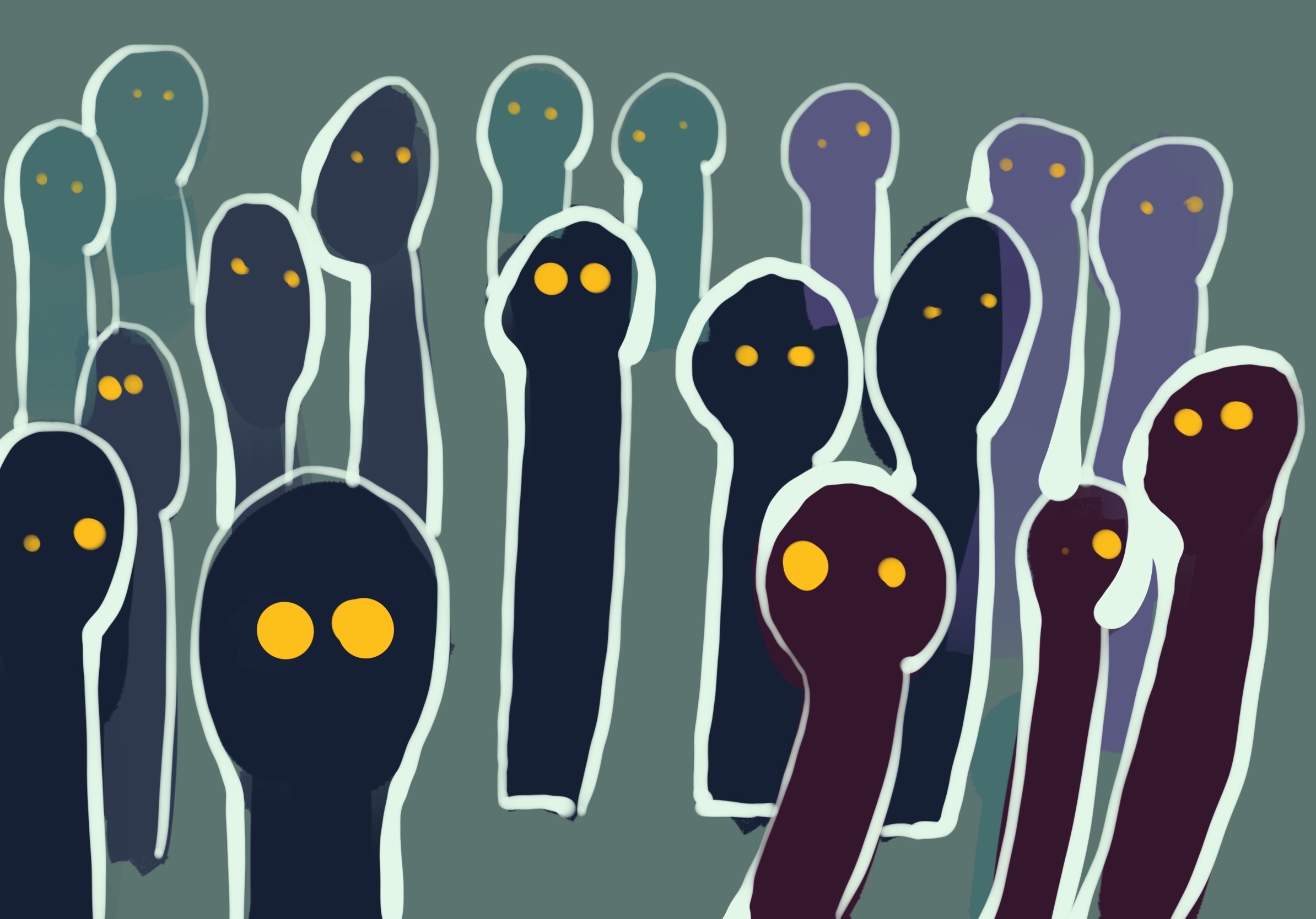
like this sketch, others’ attitude could make individual be different and strange. Besides, it could be seen as kind of discrimination. Though the expression could be invisible and weak, it would affect and hurt other.
Web construction
The basic process of browsing would like this:
User see some scene with varying elements or lighting (looks weird), so character wants to explore why this world is changing. He goes into a factory, and produce sort of factors which can effect environment and generate elements with personal expression or other information. Then he can go to gallery, garden, Computer room to see some scenes he could effect.
So, there are some scenes could appear in web
- Introduction
- Emotion factory
- Computer room
- Gallery
- Garden
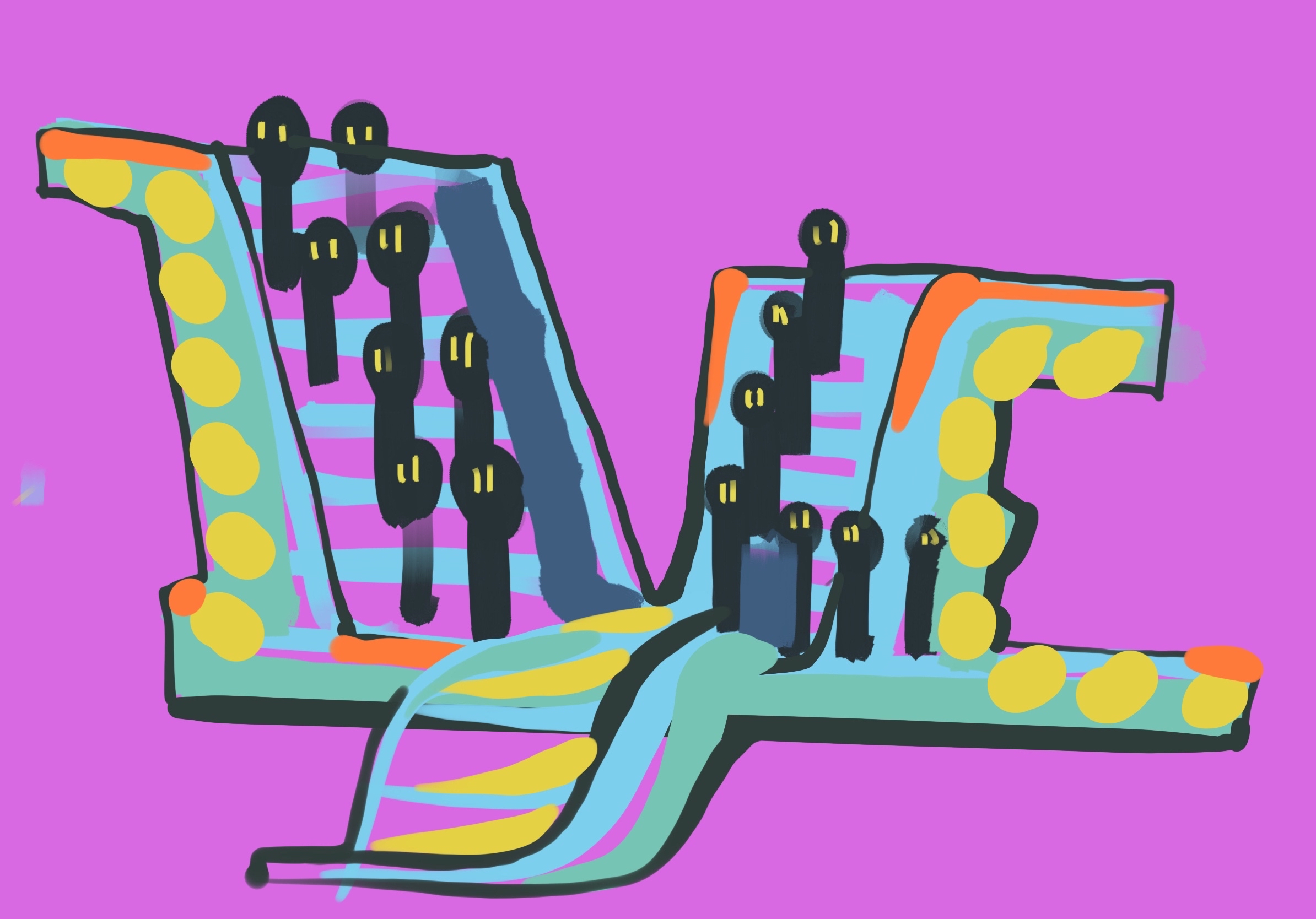
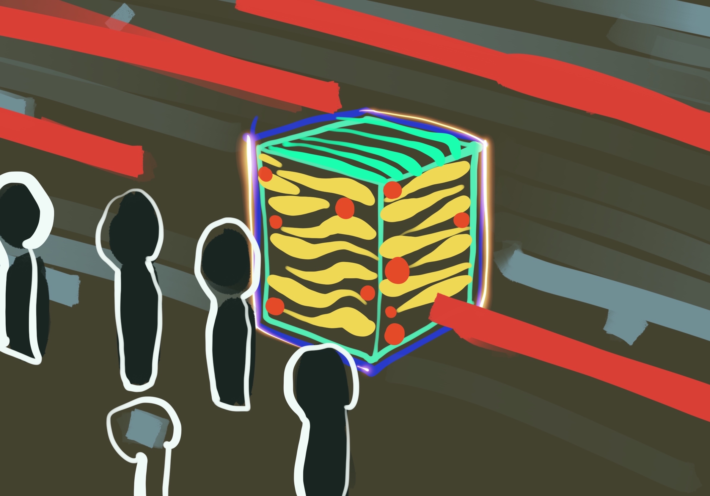
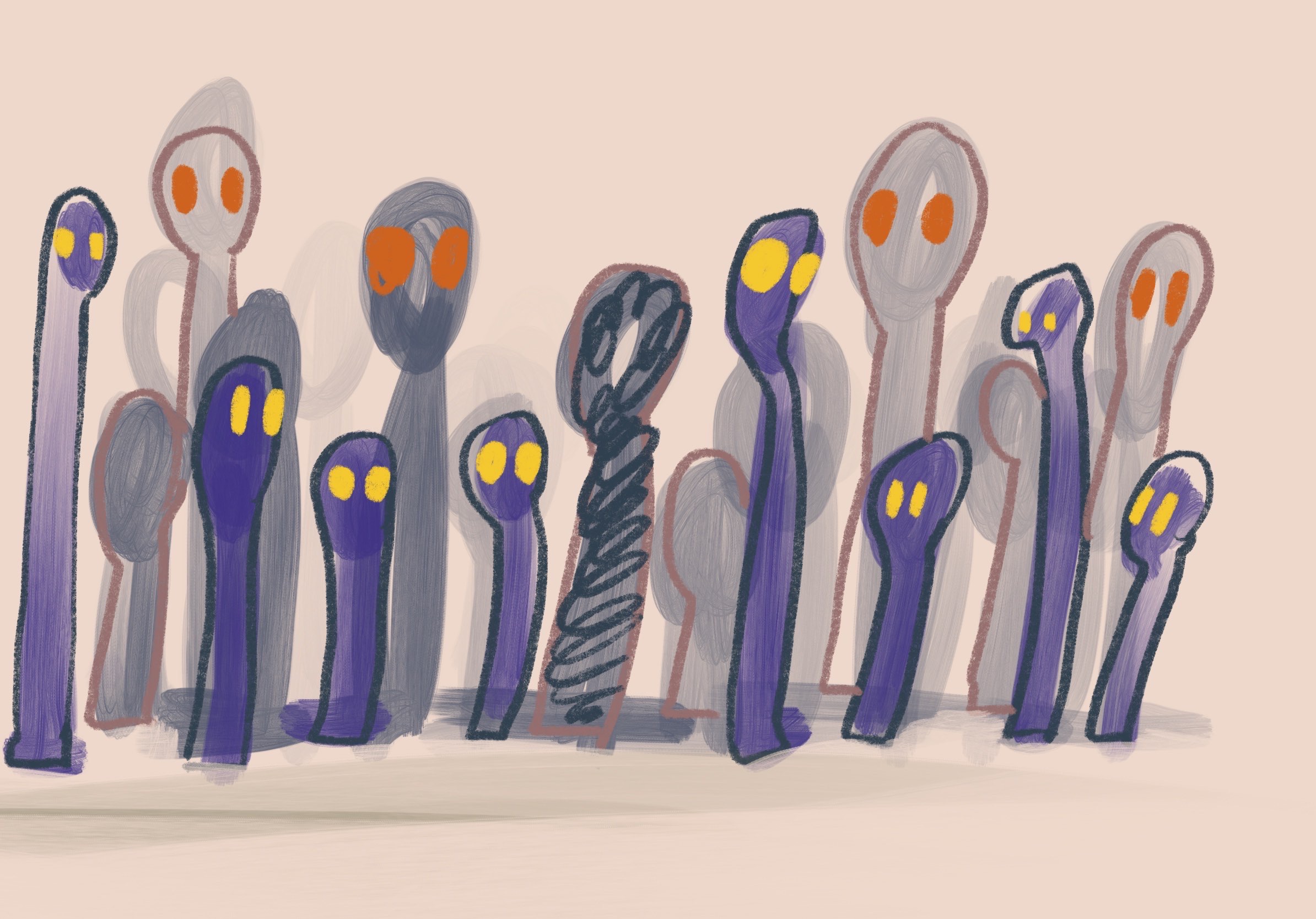
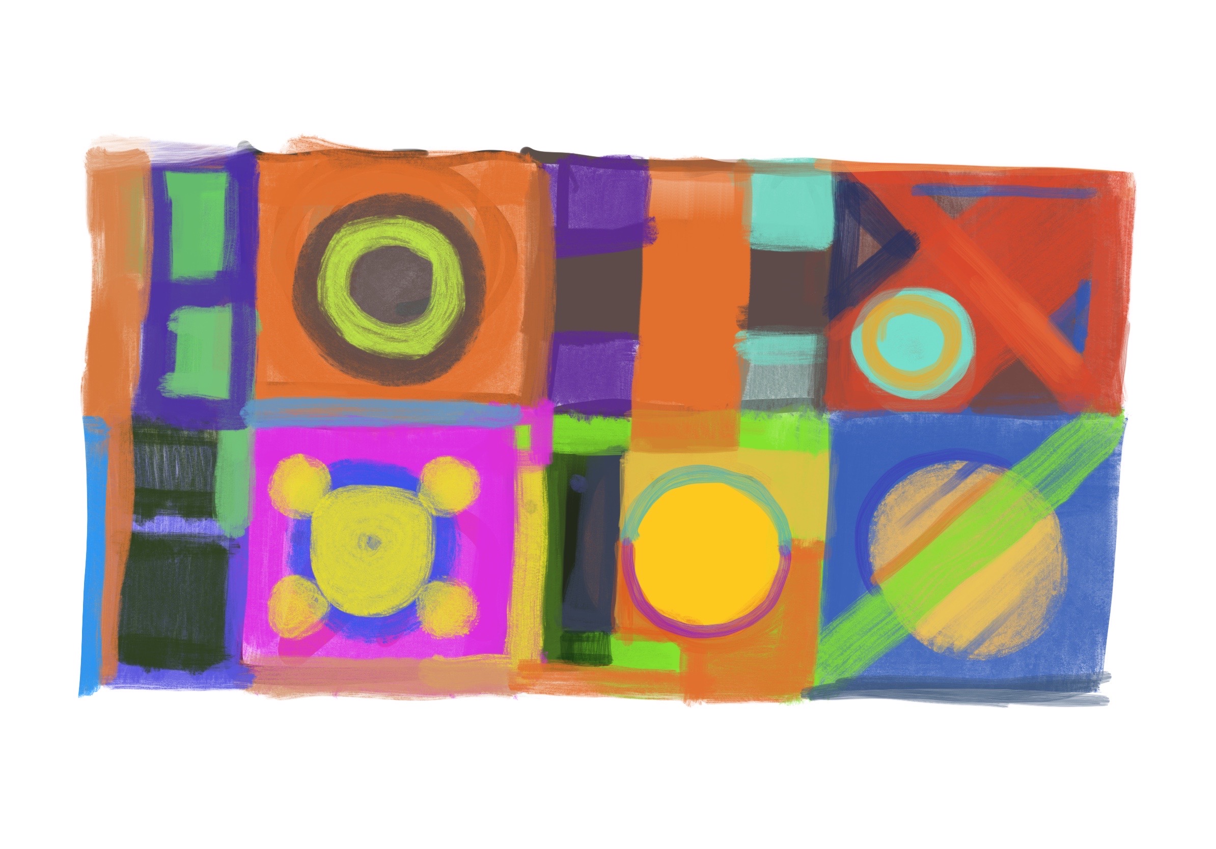
Factory sketches
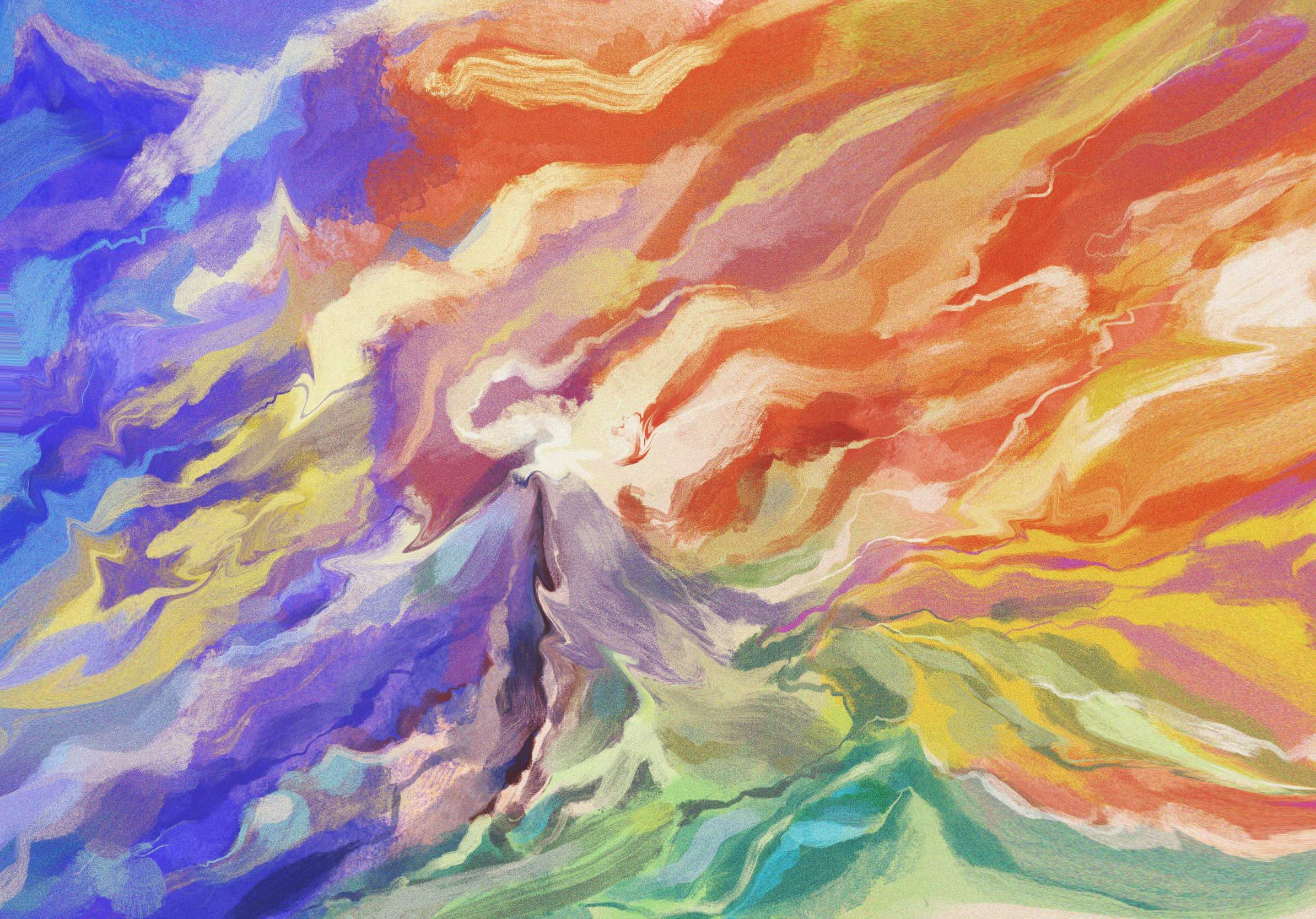
For rendering an intensive and serious (even horror) feeling, I’d like use dark, close space to show the factory scene. And couple of sketches indicate how emotion factor be produced.
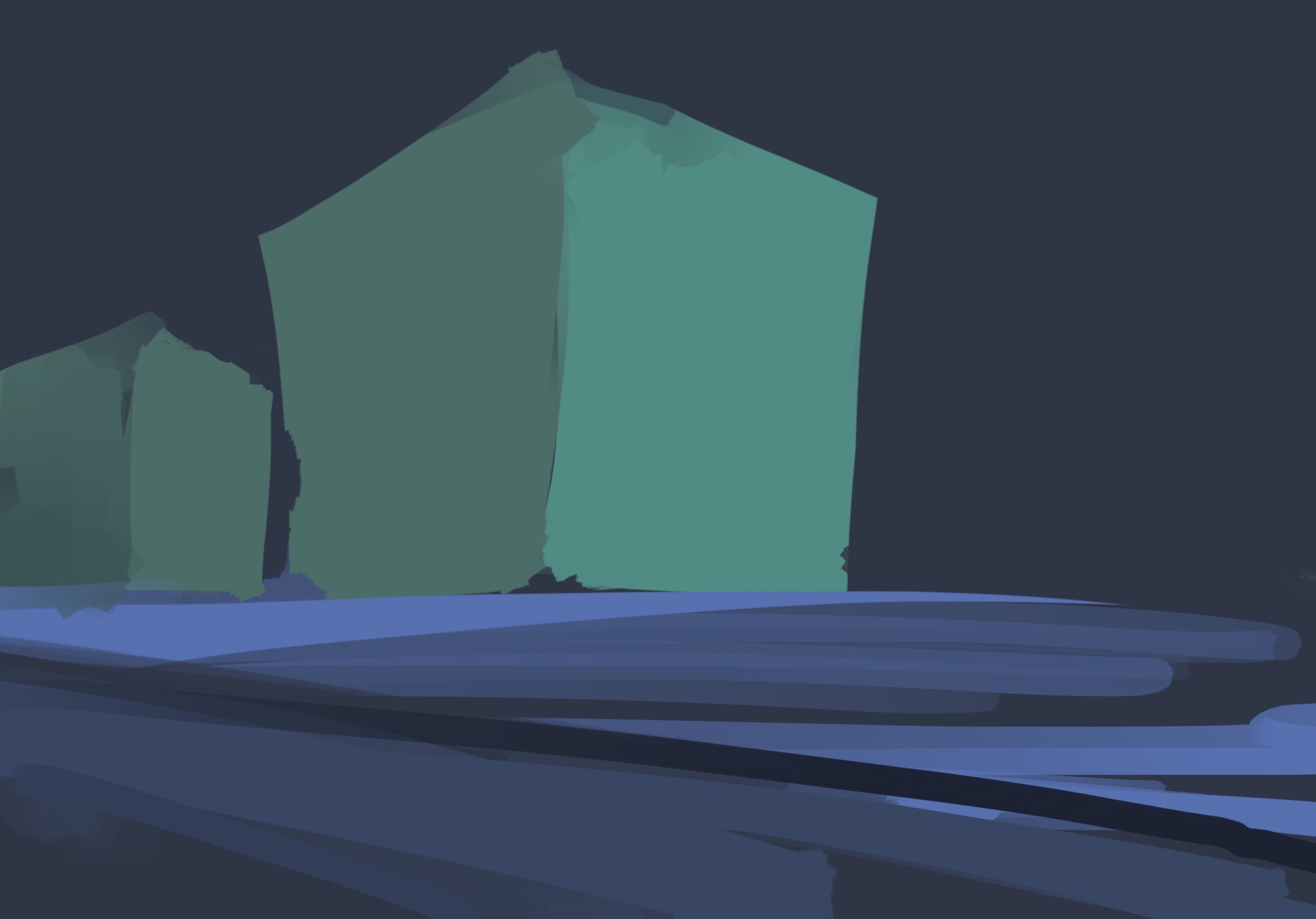
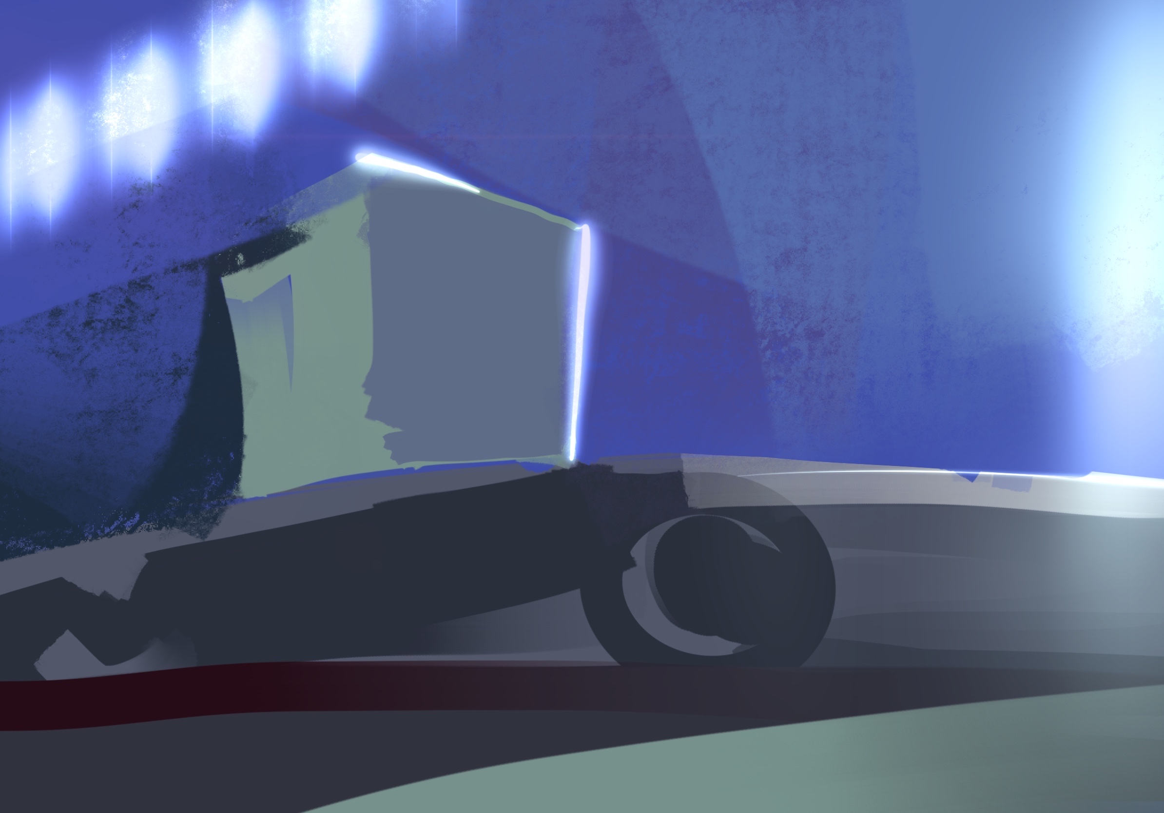
Lighting is important in this scene, hence I used BloomEffect to enhance lighting in Web.
Emotion factors
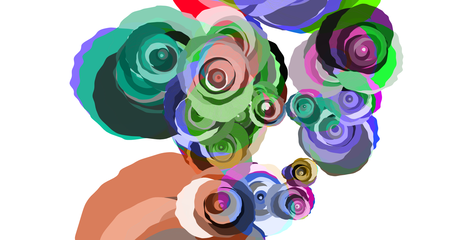
Each factor would be different, and it could represent the emotion of user in a moment. Effected by various element like temperature, lighting, sentiments, the graphic on ‘factor’ will be generated as mixed style and colours. I painted some sketched to explore the method of generation.
After generation, these pattern will used in other scene as the influence of viewer to the scene.
Problem
There is an issue for me, as I said I will use couple of scenes in project and viewer will brows them in order. However, they are hard to organisation. How camera move into other scene? At the technical point, it is difficult to create coherent connection between different scene. Besides, user need enough motivation to encourage he continue watching and interact. For me, if I am a visitor, sometimes I would not do complicated operation in an exhibition work. ( Afraid to damage it ) Therefore, the connection should be automatic, so even nobody interact with, it can play whole process.
Style
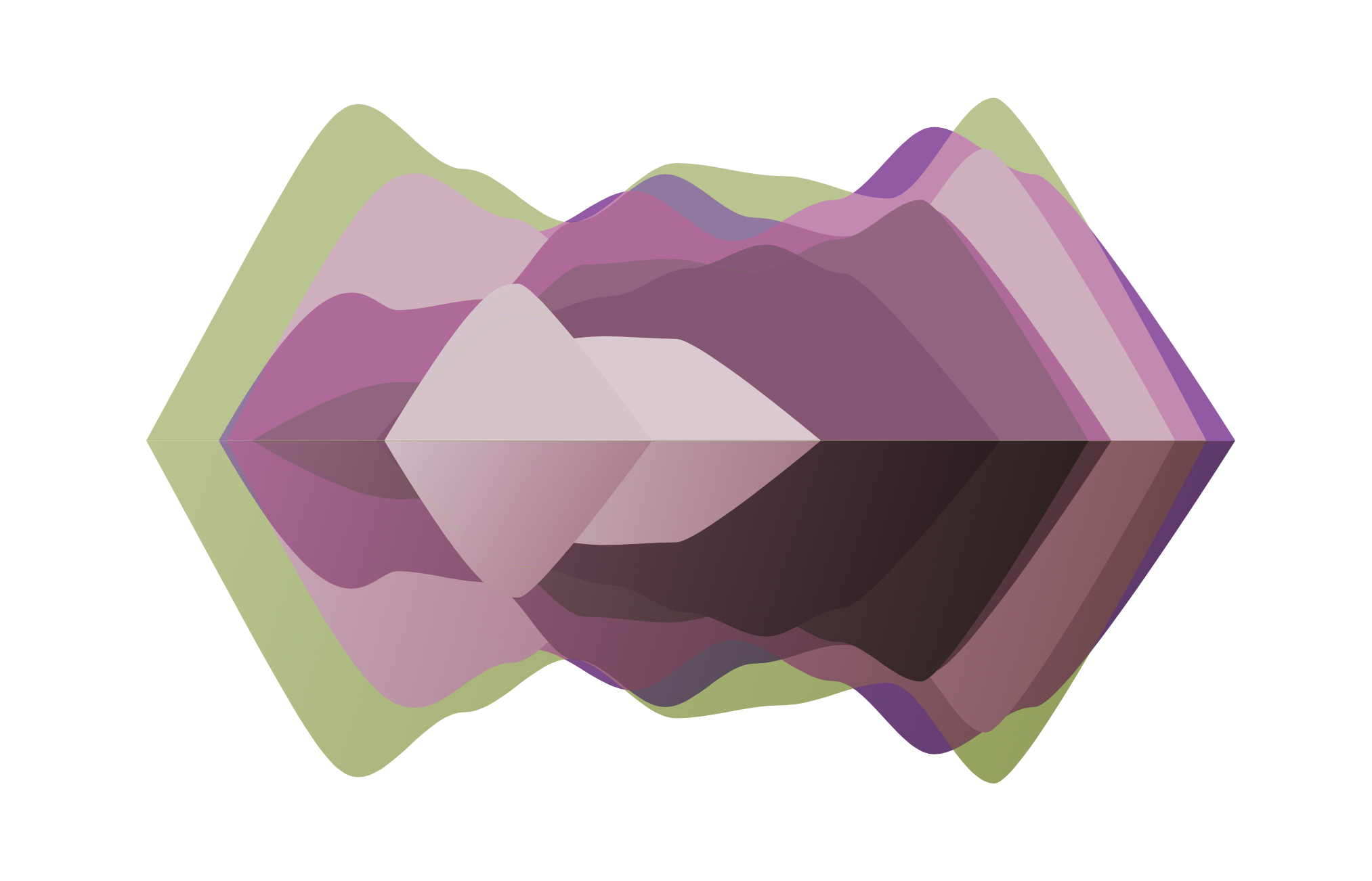
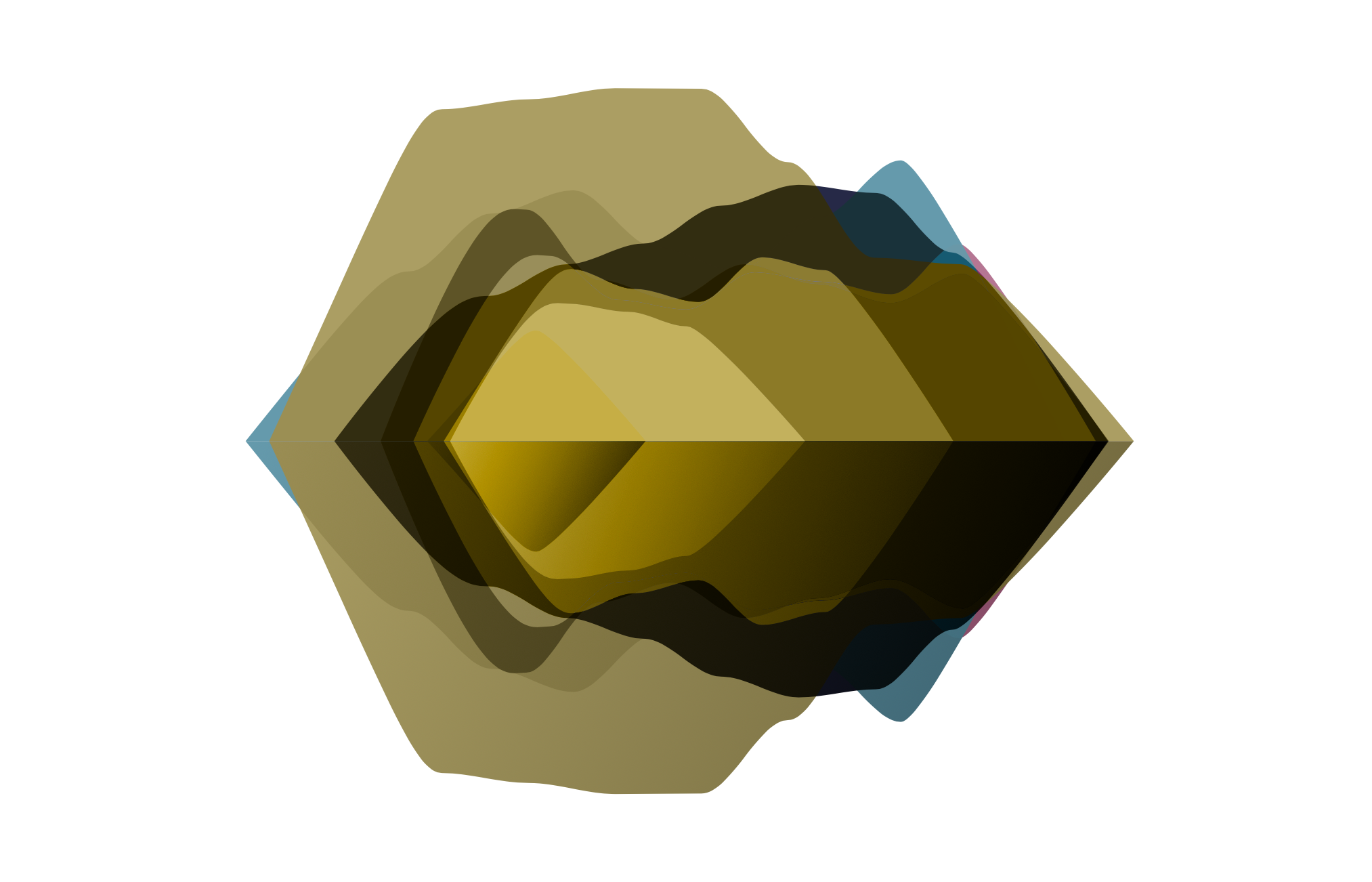
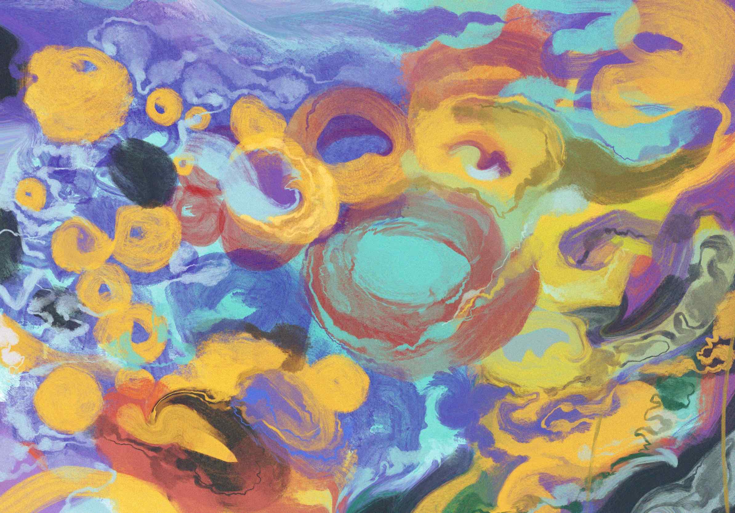
In my painting progress, I found some stroke / texture and organic outline has really strong visual effect. In my early programming, most of visual on Web is Pure vector, so the visual look simple and little boring. In future development, there’s required to add more bitmap / hand-draw elements on objects.
Next step
Completing all of scene draftily is important, so I can preview the whole process of browsing.
form intensity
For translating the emotional data to visuals, I need to find a method to seek the similarity between them. As Kandinsky’s theories, he pointed human senses have common endpoint, which means they can be cognized in a specific situation.
Emotion have different type, but there is common point in them, that is the intensity. If I explain what is intensity of a emotion, a emotion has high intensity will appearance suddenly, quickly, unpredictably and strongly. It could fill up all of emotion in mind, so it has high intensity and consistency. Since, this kind of emotion could be represented by graphics with high density.
In practice, this feeling can be simplified as simple geometric.
In this sketch, I can see the right graphic is definitely more peaceful or soften than left one, because it has more blank space so its intensity is lower than left, hence it looks not so intensive.
Another point is, curve could also influence the feeling about intensity of visual.
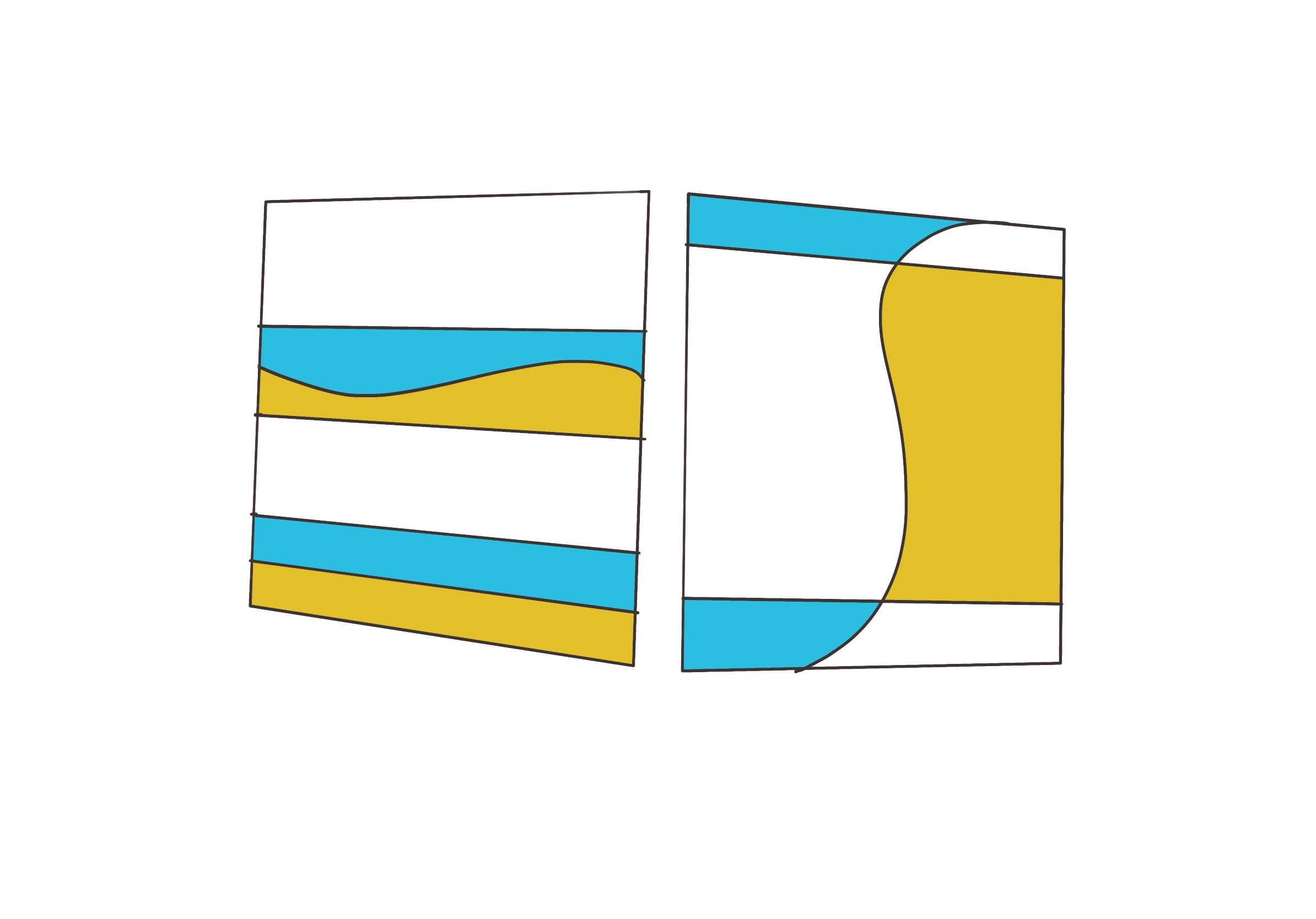
In this figure, I draw curves in different context. In left graphic, curve is drawn between two close lines. Hence it makes contrast in this situation, and it looks more active, unstable than under one. However, when curve is drawn between bigger space, it would be more harmony.
conclusion
So far, Ive found some ruler in emotion-2-visuals.
- Intensive graphic could show more quick, sudden, nervous , strong feeling.
- Curve in intensive lines could increase contrast, oppositely, it could improve the motion in graphics.
color intensity
Color can easily shock the vision, and it can be simply explained, high saturation and high contrast of hue would make stronger effect.
what Ive done
In early process, I’ve fulfilled the technic of detection of facial expression and engage it to drive graphic generation. However, the detection of facial-expression has a high frequency which reach least once/0.7s hence, the generation of graphic will consume huge of performance and would make lagging in future development. So I changed method in many times to expect a more smooth effect.
programming
The first changing is, I used 3D visual as main element in Web. Supported by WebGL, 3D element can be rendered with higher frequency in Web, so it can be more dynamic, and user can better realise the effecting of emotion.
Secondly, I make emotional data influence lighting in 3d scene rather than directly effect on graphic. Hence the atmosphere can be showed with effected by sentiments.
Thirdly, 3d animation was using in webpage. A interactive 3D animation would be attractive.
painting
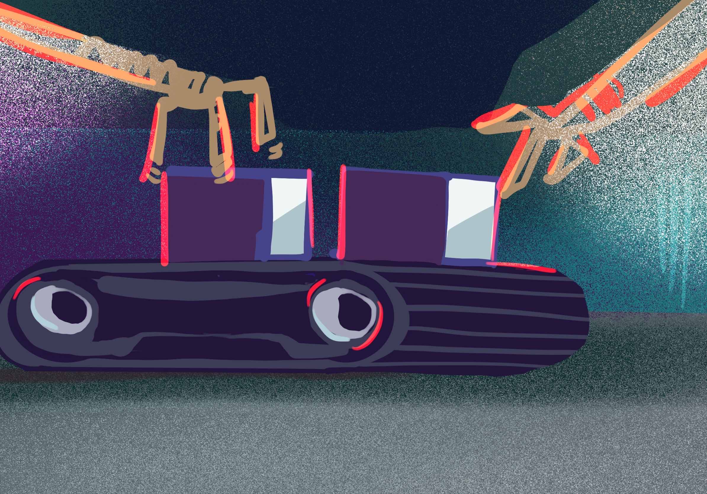
To plan the composition of 3D element, I painted some sketches.
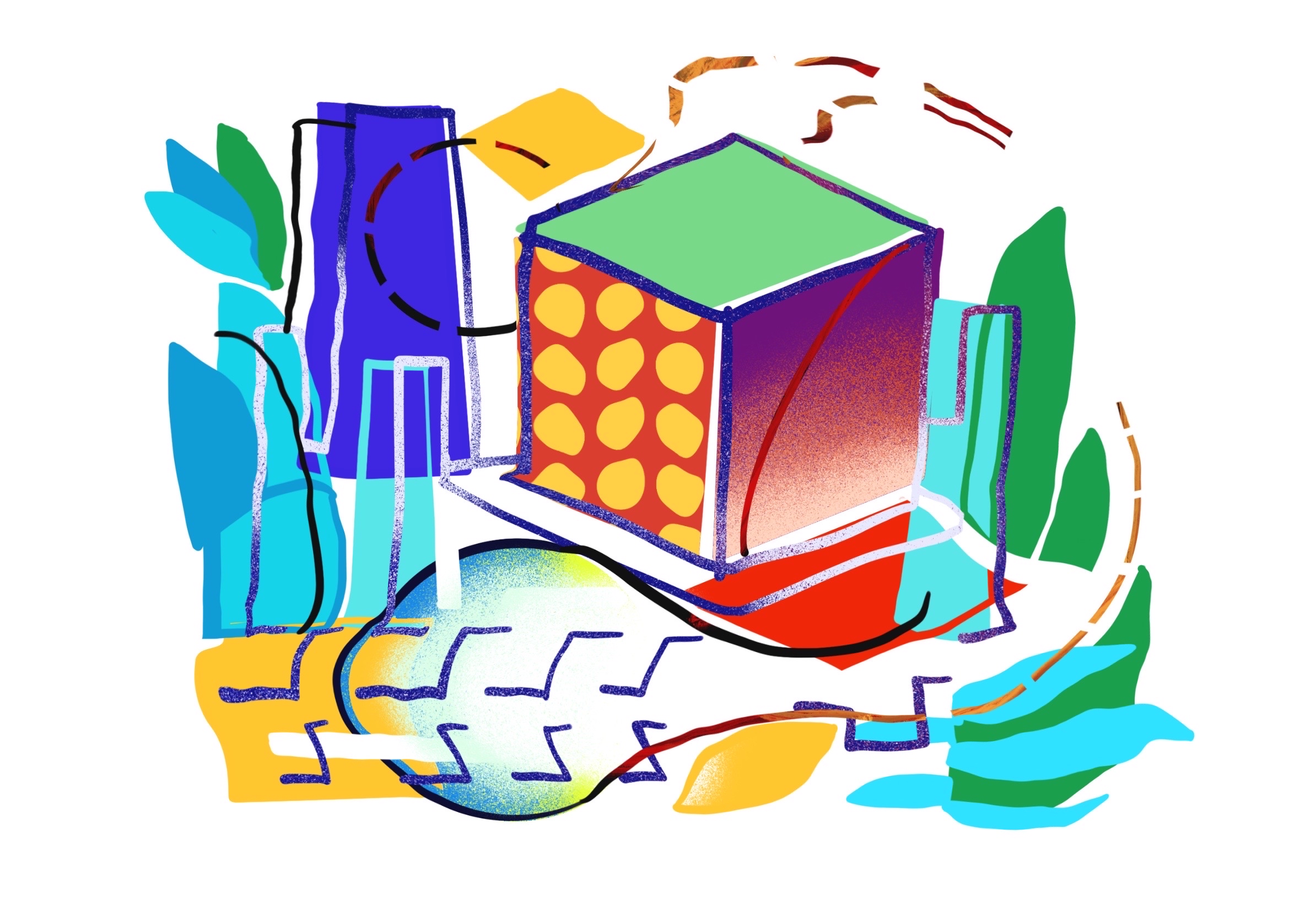
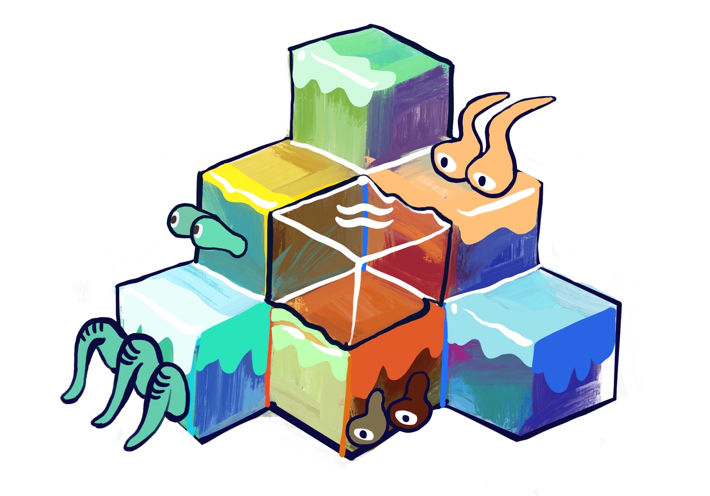
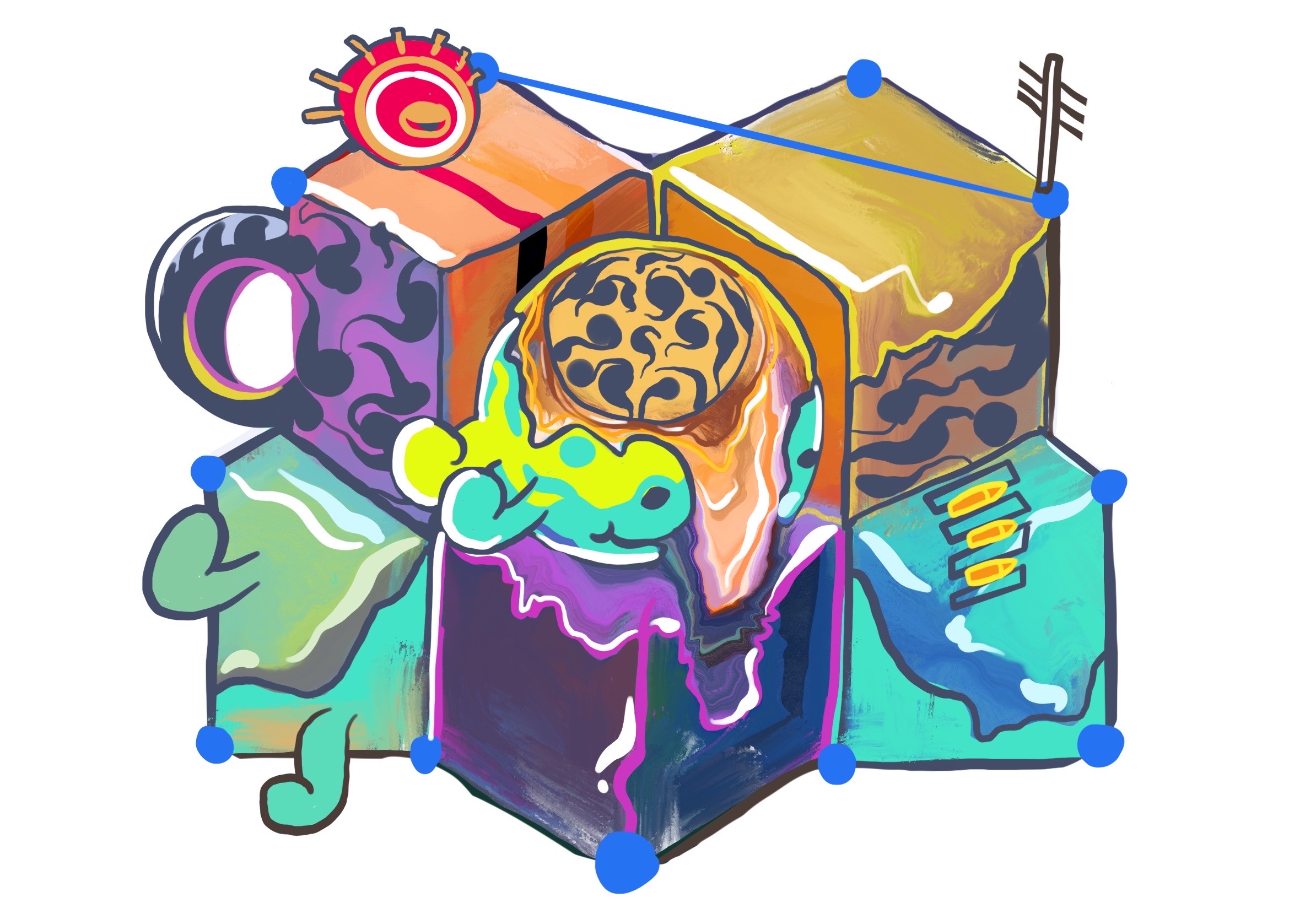
In this idea, boxes are mapped with hand-draw style texture or some mixed-colour graphics, so each box can display different feeling. Besides, this style would make work attract more young viewer, the orthographical view is popular in Web which can show all of elements with same perspective so viewer can better focus on each individuals.
Nice & Bad
good interaction
3D is good for interaction on Web, user can control sight and distance by mouse, and they can affect visuals by their facial expression during I wrote face detection programming. So in this project viewer can interact with most of elements. Not only the hand activity, but also the facial expression would influence visuals, hence it access kind of abstract interaction.
dynamic generation
Most of element would be different because the factor of them is base on real-time data capture.
bad interface
Because there are some function should be controlled by user, user interface is pretty ‘busy’ and uncomfortable so far. Furthermore, the main style of GUI has not been ensured, is it be stylish? warm? abstract or real-looking?
bad introduction
As a Web and interactive application, this work must introduce user how they control or affect elements. Hence there is a serious problem, how I introduce user or encourage them to interact with these scene in this project.
Next step
- design better GUI
- think about introduction and motivation which user would like to explore whole scenes.
- order of scenes
In past research, I found a traction artist generally seek kind of abstract expression. ‘Art as the expression’, this sentence could essentially explain what is art, and it have been agreed by most art students / practicers in my research. However, the reality which is showed in art has strong division. Whatever the content is expressed, artists should focus on the reality as it can make sense for viewers.
Reality can be defined as Natural reality and Abstract reality. The natural reality would be easier to achieve, it represent the figure of objects. When artists paint perfect shape, colors and shadow of object, they close the natural reality. It could be concluded as that, natural reality is what people can see. However, an absolute natural reality would be also meaningless, because it merely show the external element of objects,there are no additional expression in painting. As a viewer, a perfect real painting could make me remember some experience but there would not any more emotion it convey me.
In Hyperrealism works, natural realities such as material, texture would be enhanced as artists’ subjective conception. In Magical -realism, artists compose actual elements to be unreal.
In Impressionism, reality be defined as what did I see, there is a changing in process of art. Imageries in mind are conveyed by abstract reality. Artists would enhance the imagery they saw, hence the most attractive point will be showed which might make most intense impression. In post-Impressionism or Symbolism, the reality artist seek had varied to express ‘How I observe objects’, which means the feeling and reaction is the main point would be expressed in painting.