form intensity
For translating the emotional data to visuals, I need to find a method to seek the similarity between them. As Kandinsky’s theories, he pointed human senses have common endpoint, which means they can be cognized in a specific situation.
Emotion have different type, but there is common point in them, that is the intensity. If I explain what is intensity of a emotion, a emotion has high intensity will appearance suddenly, quickly, unpredictably and strongly. It could fill up all of emotion in mind, so it has high intensity and consistency. Since, this kind of emotion could be represented by graphics with high density.
In practice, this feeling can be simplified as simple geometric.
In this sketch, I can see the right graphic is definitely more peaceful or soften than left one, because it has more blank space so its intensity is lower than left, hence it looks not so intensive.
Another point is, curve could also influence the feeling about intensity of visual.
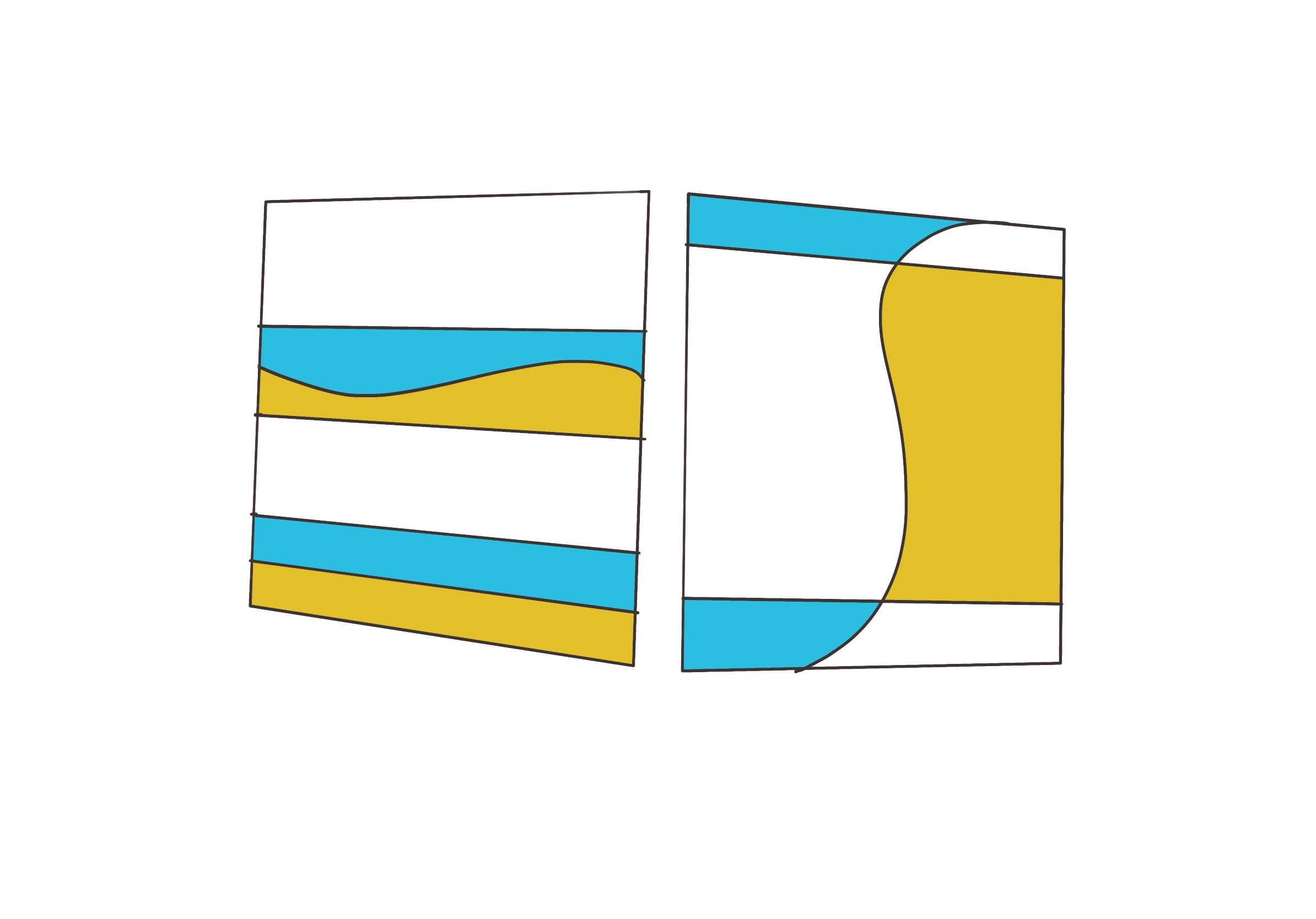
In this figure, I draw curves in different context. In left graphic, curve is drawn between two close lines. Hence it makes contrast in this situation, and it looks more active, unstable than under one. However, when curve is drawn between bigger space, it would be more harmony.
conclusion
So far, Ive found some ruler in emotion-2-visuals.
- Intensive graphic could show more quick, sudden, nervous , strong feeling.
- Curve in intensive lines could increase contrast, oppositely, it could improve the motion in graphics.
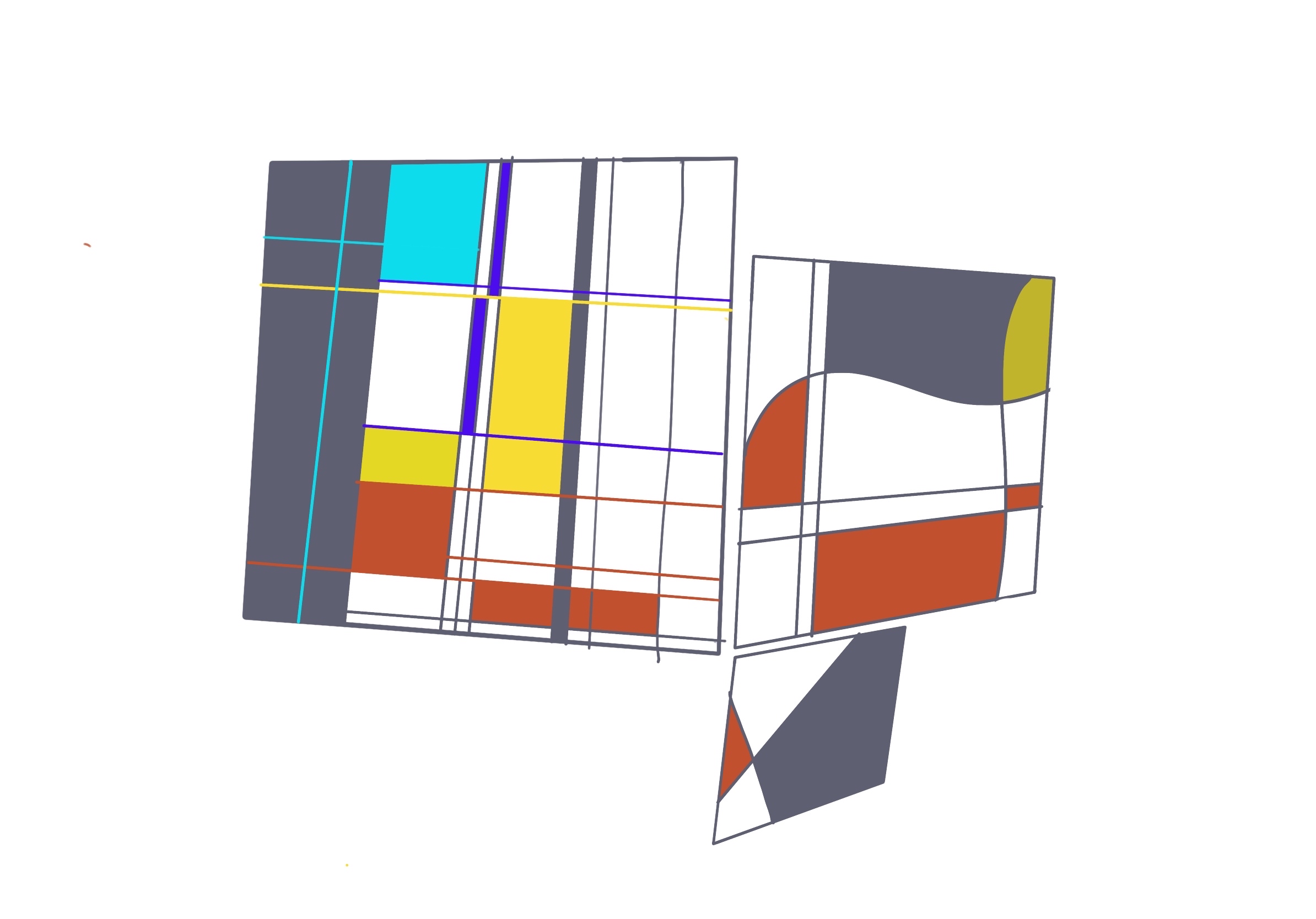
color intensity
Color can easily shock the vision, and it can be simply explained, high saturation and high contrast of hue would make stronger effect.