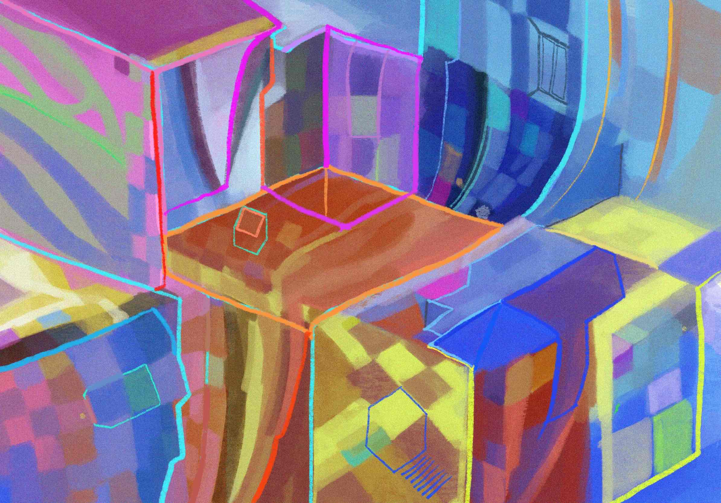
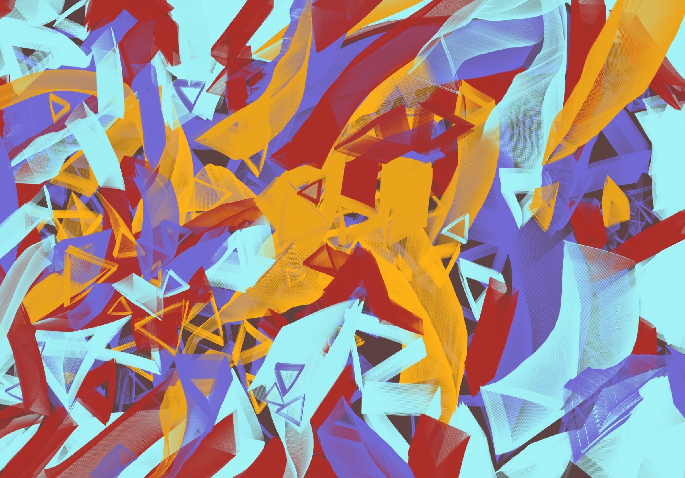
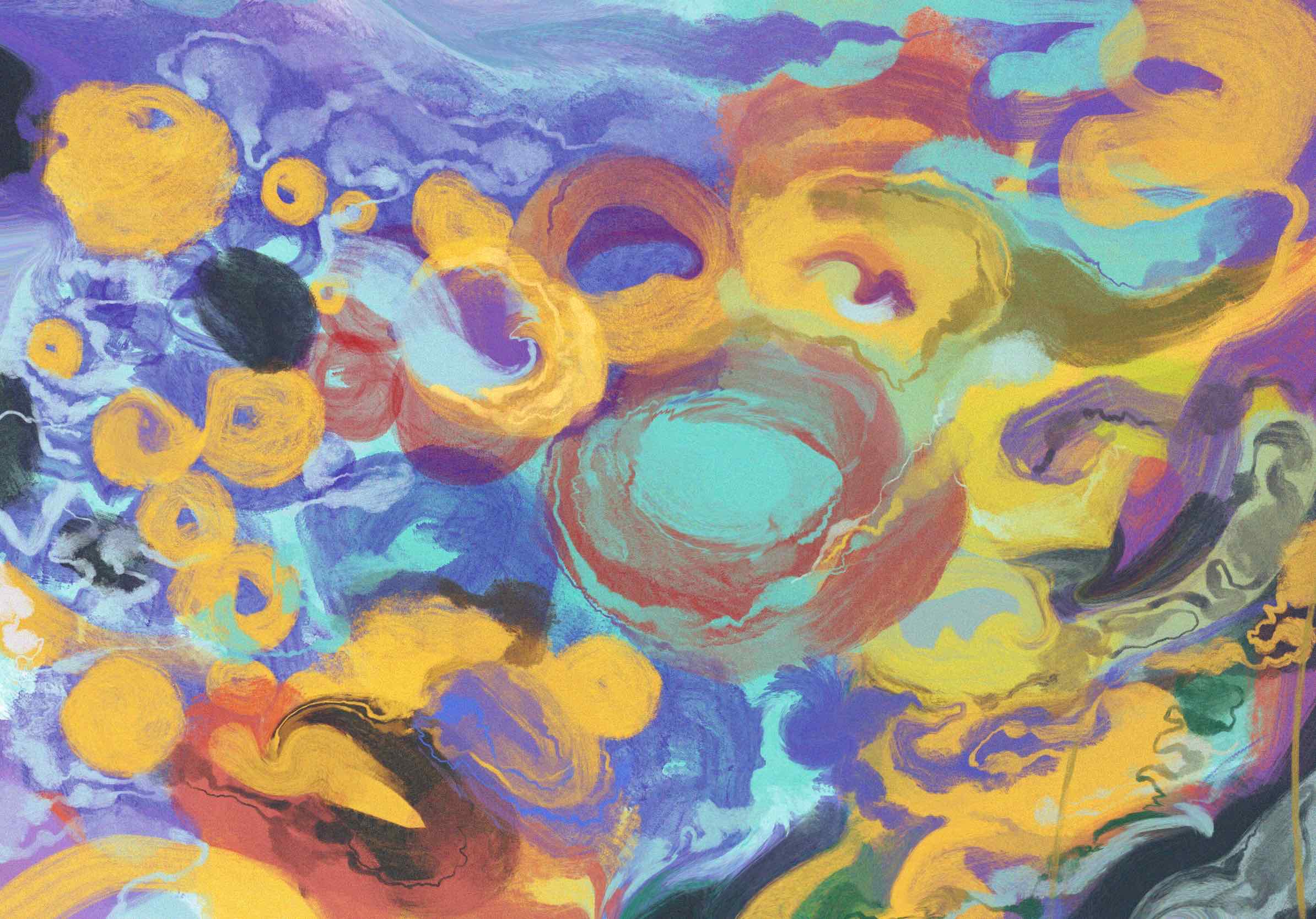

As the exploration of showing compact of emotion, I tried to use high contrast colour and mixed texutre to build symthetic visuals. However, the hireachy would easily be affected by strong colours, as well as details. Hence, I began to find some others works to realize how they solve contrast and balance.
Firstly, this work by Kandisky is my favorite one.
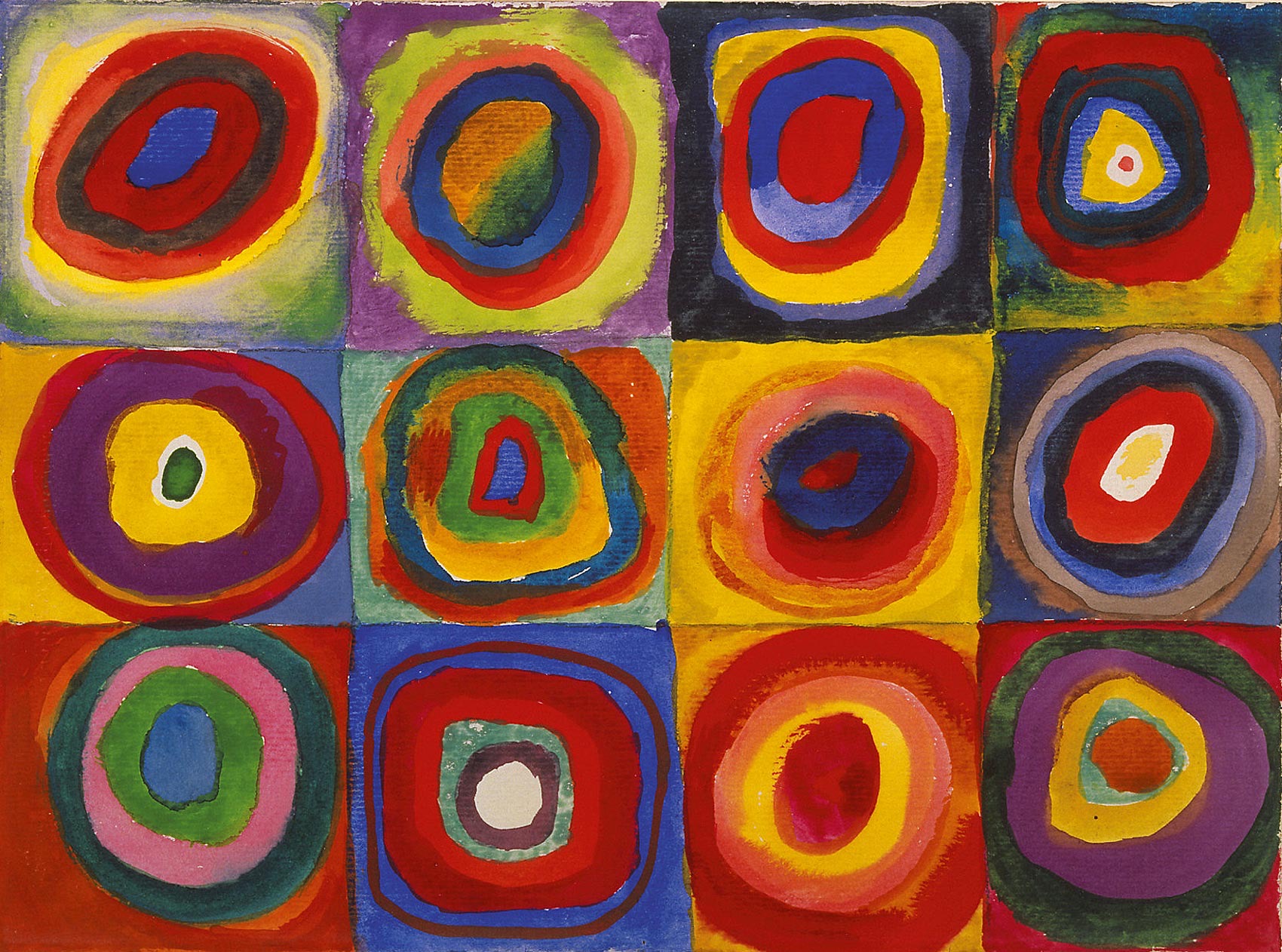
He used couples of complemantary colour with high saturation, however, the visuals seems not over intensive. The reason could be that, he used pure geometrics, and there are no complicated curve in painting. Hence these colours could not inspire memories about natural reality, they merely show the differences and contrast.
Further, in Stanley Donwood‘s works, such as:
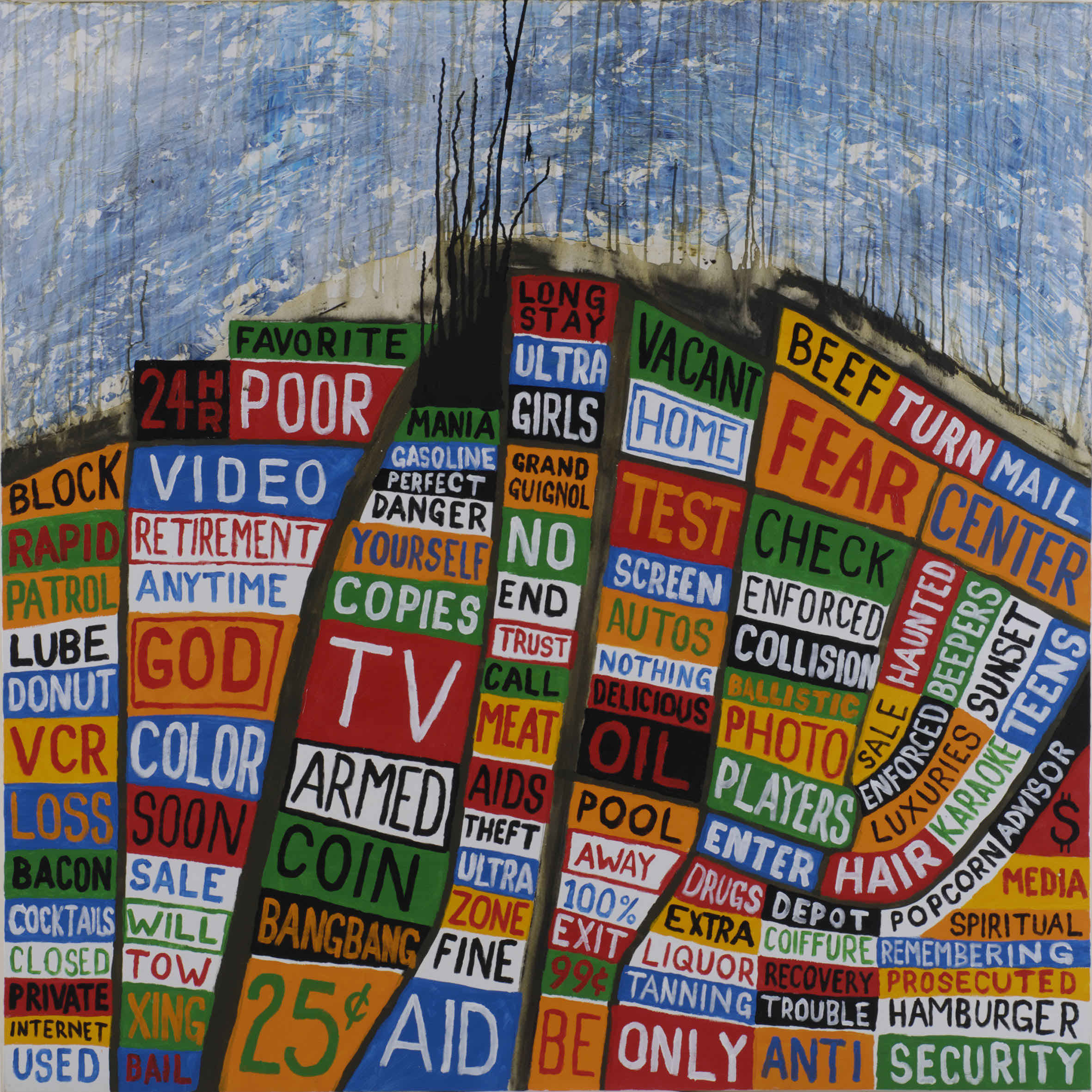
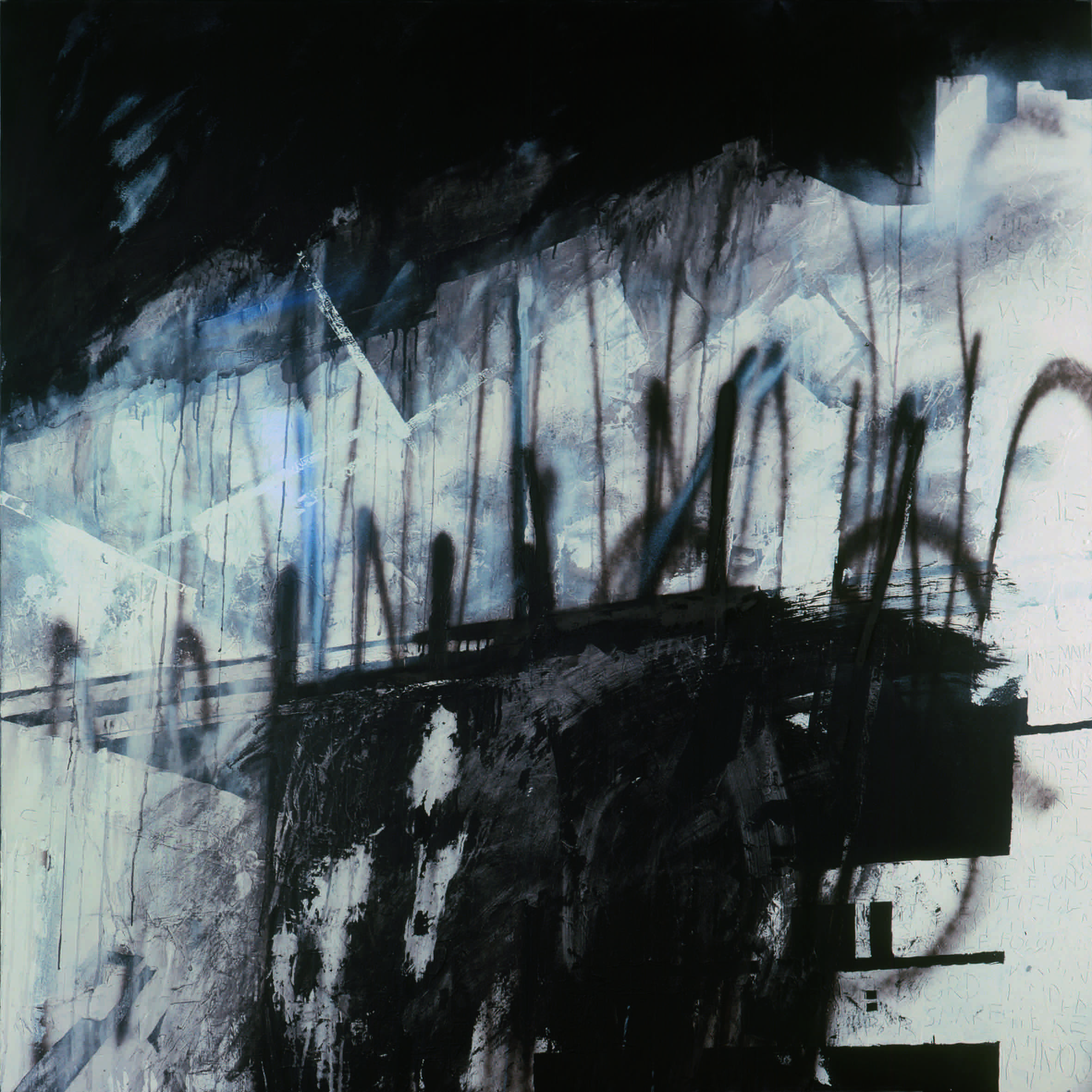
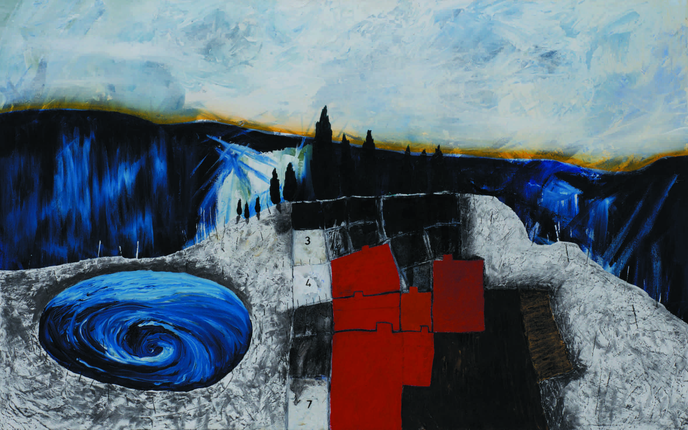
the perspective is solved well, he used geometrics to break natural perspective, simplely say, a wrong / unreal perspective would attract attention. When viewer find something not common, they can quickly feel it, and point the wrong. Especially geometrics, a geometric has unreal perspectives could make this painting more dynamic because it is abstracted by mind, and our mind allow abstract conigtion has bias.