~ 2019-10-21 >>
Recent Posts
Studio / Gallery and work process
Artist work in a studio, the studio can convey the outcome and experiment of creation. As an other kind of exhibition, gallery is the place to show artist’s work. Studio can change / effect the style of idea, it could improve the idea from artist, because of the group in studio, idea can be discuss and group by a quickly way.
Process and outcome
Is the process important than final outcome?
Different ideology / methodology in working process will reflect the variation.
Outcome can be seen as the proof of thinking track, develop, so an outcome could be the conclusion of hold project, so it is still important for reflection.
Yinka
Blur the boundary
reason of share, being a part of discourse / composition
The artist devote to improve the communication of immigrator.
He used African pattern and fabric to combine with Western arts work, even manipulate a painting with his own face.
To be honest, I don’t like his work, there are many methods to combine cultural elements, but in his way, some pattern merely are filled into a random outline.
Font
where
She put text on some specific location which suit the group can accept.
simple idea & strong visuals
the artist emphasised the font on publication, using big big size, border, solid background.
collage
different fragment from different culture
mix fragment
people could be mixture of something
use camera as blade
use grey tone, like graphite (石墨)
collage could be the way to blend materials / resource existed
whimsy
gesture
paint or photography
Individual visuals
Defining an individual language will be important as an artist, the visuals of an artist/ designer could not be accepted by all of people, but it convey own idea.
As MA student, the answer will not be given directly, we should think about it, the reason / method / development
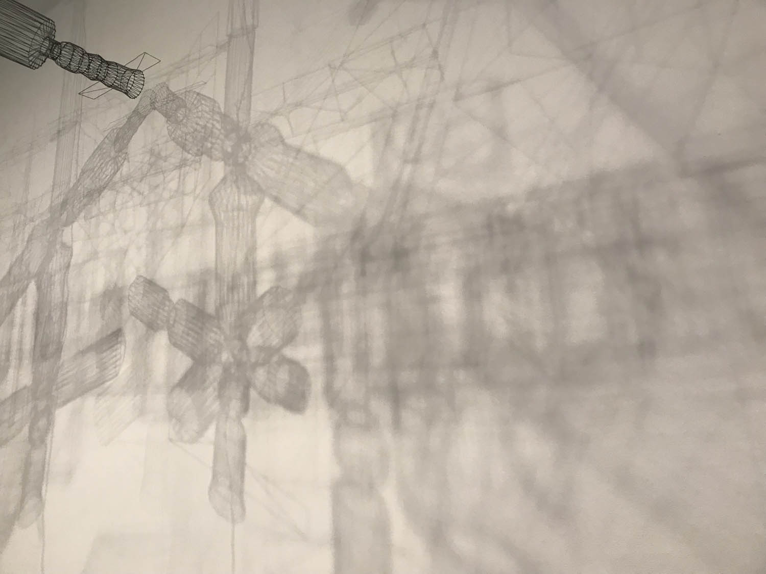
Trip to tateIn this Friday, we went to the Tate modern museum to catch inspiration. Actually, I visited here twice, but this time is still gave me new ideas even something I didn’t understand....
collaboration with a Film maker
To complete the project which require collaboration with other, I found a student who learning in MA Film. She has professional cognition in shot design, so I can get advanced suggestion on animation making or screen writing.
The early topic we chose is about relationship in contemporary partner.
Because of the culture shock, emotion between different people could be hard to understand by other who from different countries. Therefore we are going to focus more on behaviour side, which means, in the animation, the emotion expression could not be rendered as main point, the phenomenon and behaviour will be more important in this project.
Reason I explore relationship between partner
There are many developed countries are holding a low population growth, evermore negative growth. In my opinion, this phenomenon is because of the change of marry. Children and children education is becoming kind of bear in a family especially in high-knowledge level group. More and more partner have strong individual concept, and they are becoming more independent.
So I want to explore the reason people become more independent with partner, it could be include the physical factors or emotional reason.
reproduction
Today’s manufacture will copy or reproduce art work in a bad quality or massive quantity. It improve the influence of some great art works, but there are some negative influences in time:
- overexposure
- decrease potential value because of the massive copies
- change the attitude of visitor For more example of reproduction, many of art works have been displayed on Web, App, sorts of media and screen.
required commercial value
Museum or gallery announce them through reproduce classical works, it indeed in work, attract more viewer / gain more profit in sub-production. So they can have more opportunities
to protect arts.
infinite reproduce, infinite misunderstanding
As a significant count of reproduction have been made in market, audiences have a high cognition to some classical art work. In the time, they will have different attitude to these sub-production as well as paintings. In today’s workshop, my peers created some experiments to express the process of misunderstanding and distortion.
repeat photocopy
Photocopy a painting with 10 times, what does it look like? Digitally, pixel will increase, so it will lose details and sharpness. Furthermore, the colours will change to be more bright which have higher saturation. Fine lines will become bolder and look as if they’ve been engrave , because of lines look like rise up, and generate bigger contrast with background, so it has an engrave-alike texture.
de-adjective
People generally describe and understand object through read adjective. A peer removed most adjectives in a text which describe the girl with pearl earring. Then she found it look as if it is describing Mona Lisa. It shows the influence of second-hand cognition, people will easily change the attitude because of different descriptions. So I thought we can see something in different angle, a general sight and illustratively.
Reflection: About programming and concept of building Web
Basically, I’ve finished this Web during this term. To summary, this Web is designed to devote translate words to graphic information. The content I used is Chinese classical poem, I catched poem by JSON which be supported by Gushi.ci. Therefore, user can get massive poem randomly, and they can try to understand it by graphic as well as the translation supported by Baidu’s API. Now, I’m going to conclude some problem I faced, and the final solution.
use Javascript module to create elements in time.
The target is showing a gallery on Web, there are many of image had been upload on cloud server, and display by href Link. I collected all of link in JSON file, and the Web can read link than create elements.
module style and Event
As ECMA6 declared:
$('body').append(`
    <p>Content:${Variable}</p>
`)
` (反引号) this symbol can include string and variable, which means it is easy to create module and generate elements on HTML.
The question is I should add event listener to elements for motion and interaction. After every new generations, I added event listener repeatedly, which means when user interact with that element, it will response many times! The original method is:
Array.from(.elements).forEach((t)=>{
    t.addEventListener('click',function(){
        ...
    })
})
To add EL for every elements, I chose a class, and set to an Array, so it can use forEach() to iterate (遍历). But, the existed elements will be added EL again, which is horrible..So I changed the method of add, I chose the last element which is the last generated, and add EL for it. The important thing is Selector.
The SVG object can be chosen by CSS selector or DOM selector, so I would like to set attribute of SVG by Anime.js
let cir = svg.paper.circle(x,y,r) //create circle element
cir.attr({
    class:'.cir-in-svg'
}) // set class so it can be chosen by CSS/Anime

anime({
    targets:'.cir-in-svg',
    translateX:[
        {values:100,duration:1000,easing:'linear'},
        {values:0,duration:1000,easing:'linear'}
    ],
    opacity:1,
    duration:function(el,i,l){
        return 500 + i*100  // el=targets,i=index,l=length
    }
})
SVG can be set by CSS with a good performance and interactivity. So in future work, my main direction will be vector graphic and interactive animation.
add a random item from existed Array
This is a really usually requirement in WEB application, users could load more elements in time, but if every times they click and see same arrangement, there will not be cool. There is a simple solution: create a new array, **random** select an element and push to new Array, then return the new one, I thought. That’s wrong. Because it will add repeat elements, if randomly choose. So, the new solution is use Set type which declared by ECMA6, it like Array, can be iterated by for(..of..) The most important thing is : Set can not save same element
const originArr = [a,b,c,d,e]
let ranSet = new Set()

do {
    ranSet.add(originArr[Math.floor(Math.random() * originArr.length)])
} while (ranSet.size<5);

let    newArr = Array.from(ranSet)
So, the newArray is the new Array which is absolutely random.
Reflection: CCV type-3
After 5 days, I basically understood the using of p5.js 😃, so I continually refine the idea about visualisation of CC (Chinese Character). To definitely show the differences of characters, I chose Strokes counts to generate points and lines. In this article I will describe most progress and details.
Point & Line
As my early experiments, the words were analysed and render as SVG shape, and these shapes are similar with real symbol of tone. It can clearly show the tone of words, but my expectation is not only show Tone of word. Individual elements should connect each other, as same as the composition of sentence is words.
To express the composition of sentence, I decided to use Lines as the format of compose. Which means every words will be translated to individual elements, and they connect and group as lines.
Now, I would like to remember the process of create lines.
Thinking process/ methodology
Two points can be connected as a line. (两点一线)
It is really clear, a creation of line in computer, should have two points, and each point should be marked as X & Y. Therefore, I should provide X1,X2,Y1,Y2 to draw a line in programmer.
line(x1,y1,x2,y2)
So, I tried to make groups of points, which base on Stroke of count.
CCV type-2
Here is the first outcome of Points, the quantity of points equal the strokes count of word.
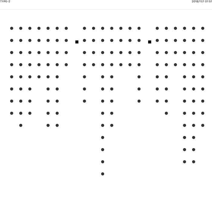
To be honest, it is really simple, even ugly. However, the only reason I did that is, I try to successfully create right counts of point.
CCV type-2+
Next step, I connected every points, by lines. There are many developments on logical stage, I will list that but it is so complex to clarify every things(太懒了,解释不清):
- Wrap 换行
- Javascript Object
- Loop render 实时渲染
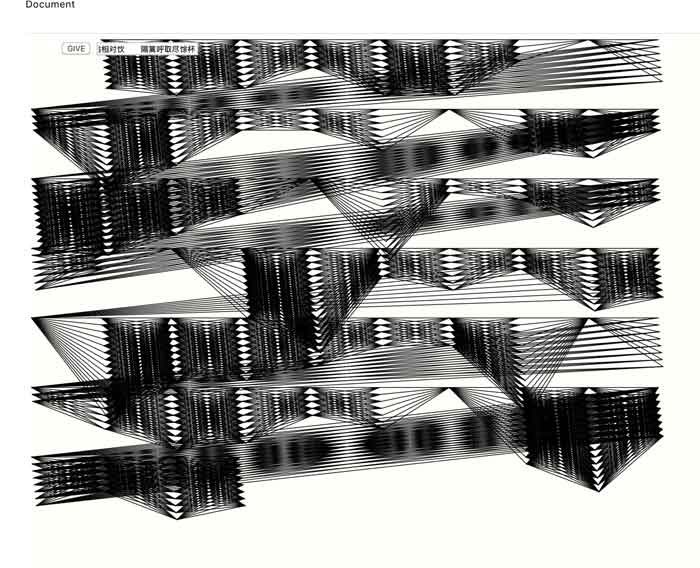
Actually, it is more ugly than I did before. Firstly, black is too thick when it shows on dense lines. Secondly, the order of points is too regular, so these lines create many sharp negative room, which make too strong contrast. So bad. 辣眼睛啊.
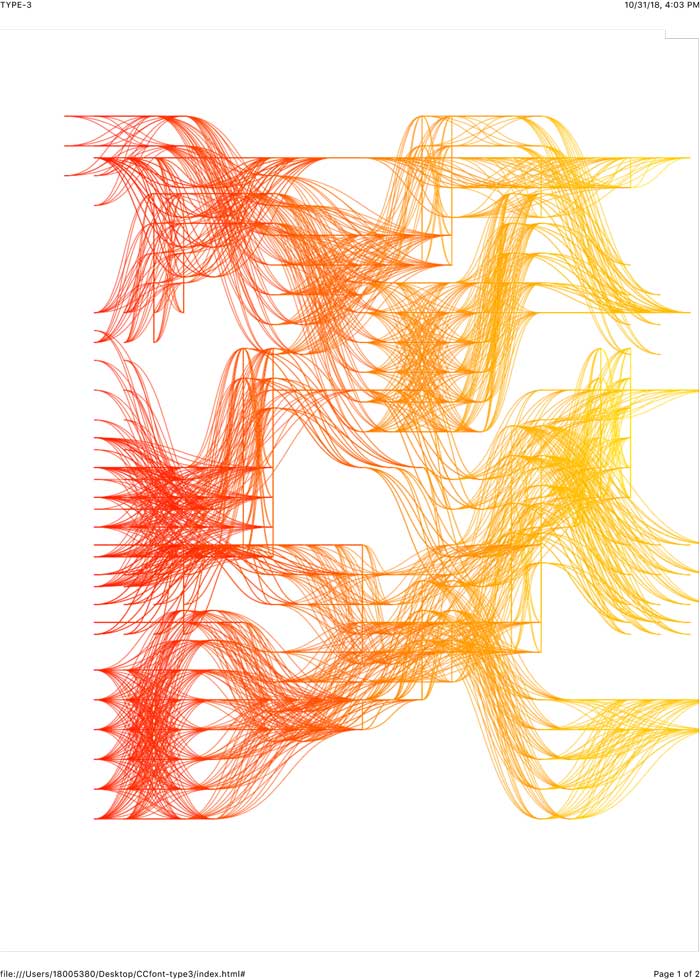
CCV type-3. Curve! Bezier curve!
To save my ** thick work, I decided to use curve, beautiful curve. Different with hand-draw curve, computer actually not good at draw curve. Thank for great mathematicians,(对不起,王老师,杨老师,熊老师我没学好数学) we indeed have method to let computer render curve. One of that, is Bezier curve**. It means, we can set handles to control the curve of line.
Bezier Curve edit tool
bezierCurve(x1,y1,x2,y2,x3,y3,x4,y4)

//x2,y2;x3,y3; mean the points of handle.
Decoration
As MA IVM student, it is impossible to work without decoration. Actually, not only decoration, but also for better interaction and communication of user. In this step, I begin to consider the outlook of webpage, such as colour, layout, interaction and performance.
colour
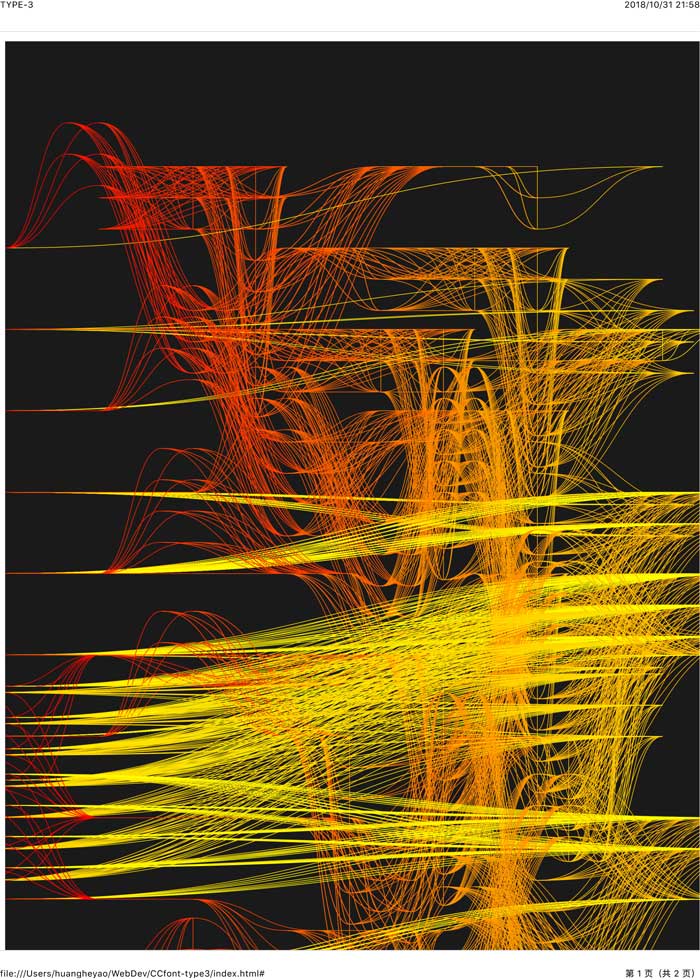
I changed the colour of background to show more strong curves.

download original image on Dropbox
layout
Currently, there are some questions need to develop:
- Input might be available to move with viewpoint, so user can preview the image when they are typing.
- Button extremely need to improve! Difficult to understand, ugly style. 天啊.
- Poem bank should be easier to use, and I might be should add more one box to show the content, so user can save more time.
What’s poor imagePoor image generally are low quality digital image, which means it is defined base on sharpness and resolution....
Get stroke counts
After last tutorial, Ive continually developed the Web project. I added new function to get the strokes of words which user typed. Then I would like to reflect the hold process, what difficulties I faced, the idea I got, and the methodology of reach.
Retrieve database
The principle of analyse data actually just search database, which means every element I might use, have existed in database, it could be prepared or made in time.
It is easy to get data, such as stroke counts of word, but the difficult thing is to translate that to a new data, which can be used to generated shape.
Data-driven shape
Data-driven graphic design 32p:
“Unlike the physical process of making a mark with a pen, brush, or even a digital tablet, computational drawings are created by a written list of programming instructions based on rules and procedures that a programmer writes, a computer translates and executes the instructions into individual marks lines, and shapes on the screen.”
Computer generate different graphic base on the data have supported. In current stage, I want to use ‘Stroke’ to effect the format of graphic, which means how shapes group up and how they connect each other. The reason I thought is, Chinese word s sometimes have big differences in structure and strokes, it will effect visuals. The strokes will influence the complexity of the outlook, though it is irrelative to meaning generally, it can clear show different characteristics of words
Make points as coordinate
I create a series of points by strokes count of each word, so every word will have some points which can be the coordinate. In future work, some specific shape could be set in the coordinate. Furthermore, basing on different Tone, the layout of point could be changed, because Strokes merely influence the quantity of points.
render graphic base on different coordinate of each words
The question is, I haven’t decided which way I render graphic. There are two method to render graphic I can use now,
SVG available me to create more beautiful/ delicate shape with high-quality resolution. And Bitmap graphic can generate more curve and massive geometric shape. In future work I will do that both and choose one or both as final effect.
The difficulties I faced now
data analyse
在早期进程中,变量的提取非常困难,尤其是我需要逐个把用户键入的字符匹配数据库,当匹配数据库后,再分析它的别的属性。逻辑层面必须非常清晰:
用户键入————每一个字————属性,如笔画读音偏旁
拼音,检索音调;
笔画————生成坐标,
坐标————通过笔画数判断坐标数量,通过别的属性决定坐标排列方式
偏旁,检索特定的含义,其含义必须被单独设定,手动
whole style
The work must be designed to illustrative, it should give the feeling of words, it doesn’t represent a whole sentence, but it should show the abstract meaning of words.

Reflection: Early experiments about visualisation
In this stage, I’ve done a prototype of visualisation application, it available user to support dynamic data and translate to geometric shape. I used JavaScript to build the application as well as NodeBox and illustrator. Then I will review the process of work.
Source of idea
At first, we visited the V&A museum, there are series of digital arts exhibited. I observed the layout and variant of graphic, but was confused by the irregular shape. I tired to find the reason and the meaning of artists want to convey. I failed.
这些数字渲染的作品充满了不确定性和随机性,但是不变的是他们的排列方式。艺术家用特殊的算法计算了图形的位置,并通过控制变量的方法让图形拥有不同的形状或者结构。
In M.Mohr’s work, I saw his algorithm generate shape as random symbol, they are ordered in grid system with a tiny translation of position. So I want to collect information and data as variable to generate more specific shape. I chose Chinese letter as the source of information, because Chinese letter can be separated to be different parts which have individual meanings.
Work process
To complete my idea, it is important to distinguish the letter. I set a database, it will return the value of phonogram, stroke count, radical of letter whatever user type are( except special/strange word or symbol ).
After return of data, I used JS to analyse that and change the image which show on Web.
通过的采集的数据的分析,再遍历数据库,当有匹配对象的时候,返回它的详细信息,例如拼音,笔画和部首。 通过拆分返回的拼音字符串,再遍历每个字符串,与音调的数据库匹配,返回后即可以得到那个有音调的拼音所属于的音调。
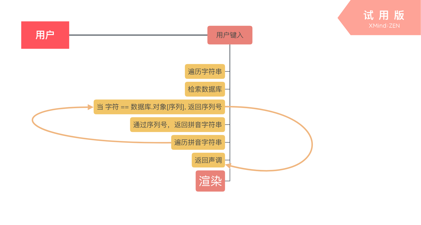
Base on the tone of letters, specific shape will be set on Web. The method of render image is add and append tag in DOM as
<embed src=Dynamic link>svg img</embed>
Goodthing
To see a draft effect, I chose tone as variable to make graphic. I successful complete the logical stage (逻辑层面). Though it just show tone as characteristic of a word, it is easily to add more effect on shape. It clearly shows the differences of Chinese character which same as my first expectation
Something need to develop
More illustrative
I used shape of symbol to show the tone of word, which is same as we daily use. But the final outcome should not be the showing of symbol. The expression of tone might be a method/ structure when rendering shape. So, they the variable from tones should have the ability that show the change of tone/ level. Curve might be a good choice.
In future work, there will more information be add in graphic, but how should I keep a balance? What’s the composition of individual graphic?
